Les Poèmes du Mandarin
Brand Strategy & Design
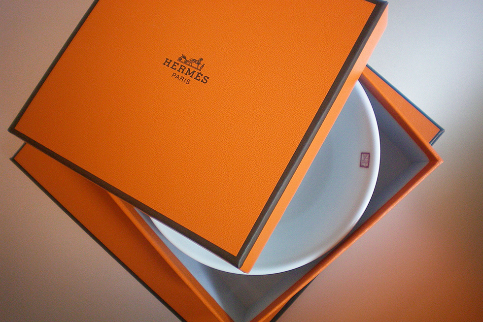
Tableware Collection for Compagnie des Arts de la Table, Hermès
Share
Service
Industry
Great brands think alike
When we created the design for the Hong Kong Krug Room at The Mandarin Oriental Hotel, we initially approached Hermès to provide the tableware. Rewarded with a unique opportunity to design a bespoke tableware collection, and armed with the knowledge that each Krug room in the world ought to be unique, we set out to create a design that would include an artistic connection to Hong Kong, as well as resonate with the values of the three prestigious brands attached to the project: Krug, Mandarin Oriental and Hermès.
Raising spirits
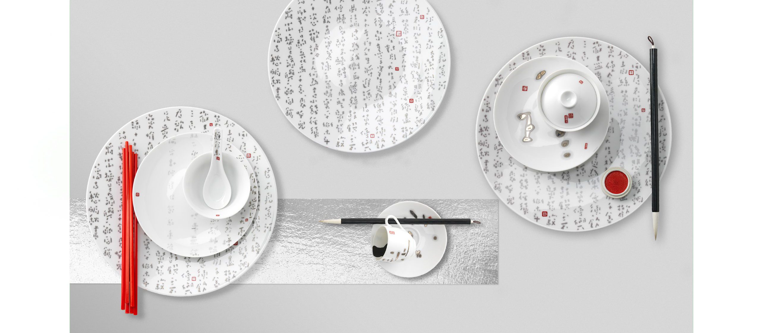
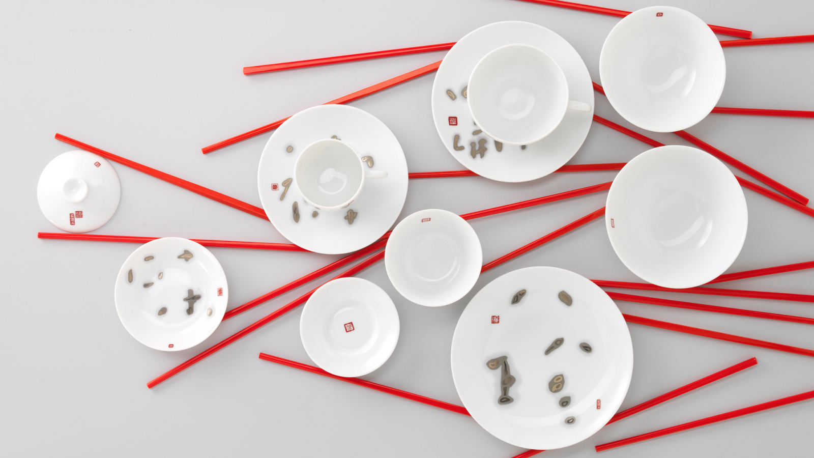
The concept was inspired by the work of a contemporary Hong Kong calligrapher, Fung Ming-Chip, whose style of script we found to be reminiscent of rising bubbles in a glass of champagne. We researched classical Chinese poetry on the theme of conviviality, and carefully selected texts that best illustrated the enjoyment of food and wine.
Ware about
Les Poèmes du Mandarin collection was first released in exclusivity for the Krug Room at The Mandarin Oriental, Hong Kong, and later launched for retail sale in Hermès stores around the world.
Timeless scripts
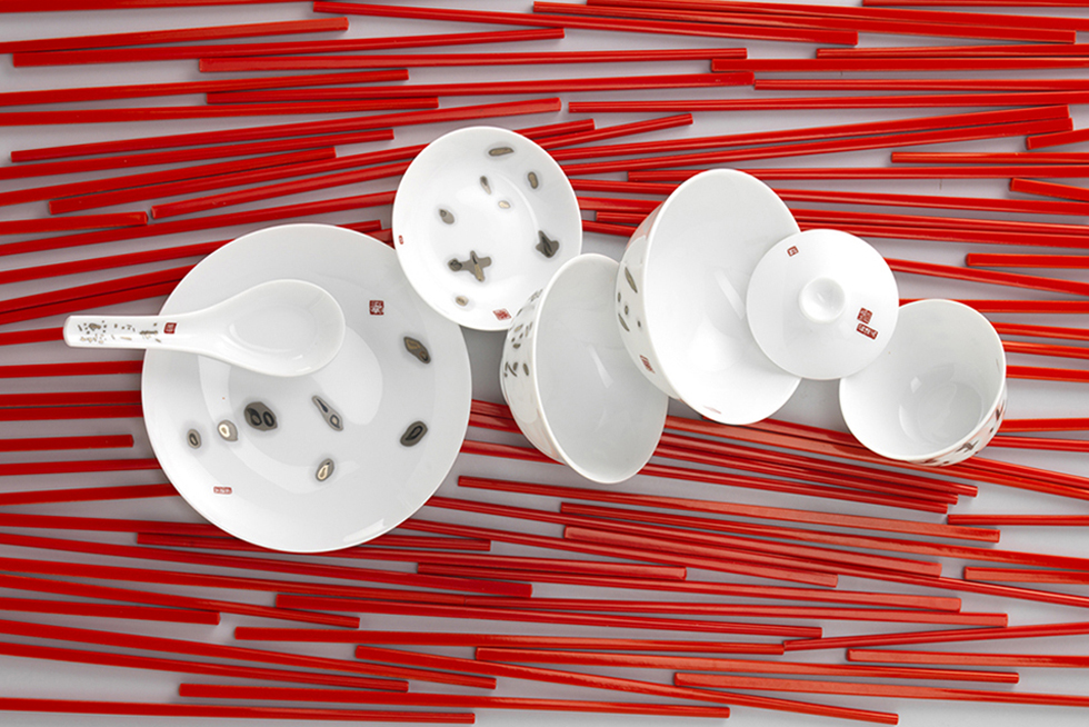
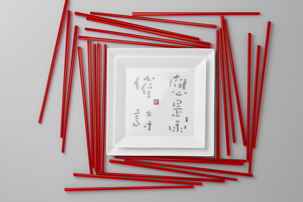
Excerpts from Tang and Sung dynasties texts, from such celebrated poets as Li Bai, Ch’eng Hao or Du Fu – were chosen for their references to conviviality, friendship, sharing food and drinks. We then proceeded to draft the design for each piece, in order to give detail directions to the calligrapher.
Mark making
The collection’s signature is designed to graphically acknowledge the collaboration with The Mandarin Oriental, the letter M reflecting a vintage element of their visual identity.
The art of composition
Fung Ming-Chip’s executed the scripts free-handedly, on traditional rice paper. Our team then painstakingly re-composed each set digitally into individual artworks, much care being given to preserve the spontaneity of the scripts, while scaling and adjusting them to fit into the design. The complexity of the exercise resided in rendering that composition work ‘invisible’, the scripts appearing to have been painted in one sweep to fit effortlessly in the frame of each plate - be it round or square.
The designs are interpreted in a monochromatic palette of grey tones to faithfully render the effect of diffusing ink from the calligrapher’s enchanting touch. Each artwork is also punctuated with small and playful Chinese red stamps from miniature chops carved by the artist.