Relish
Brand Strategy & Design
Share
Service
Industry
From catering food to crafting good times
Relish began in 2005 as a catering company with fresh produce and unique flavours. With a change of ownership in 2020, the new team decided to expand from catering services to full event planning and production. They approached us to refresh their image so that it would reflect the shift in their business model, as well as the creative spirit the owners wished to inject into the experience they deliver.
All about celebrations
We began with the definition of the word ‘relish’. Other than a piquant sauce or pickle, it also means ‘great enjoyment’ and ‘pleasurable anticipation’ – we decided to capitalise on that when repositioning the brand. The concept of freshness staying core to the brand, we built on the ideas of creativity and celebration.
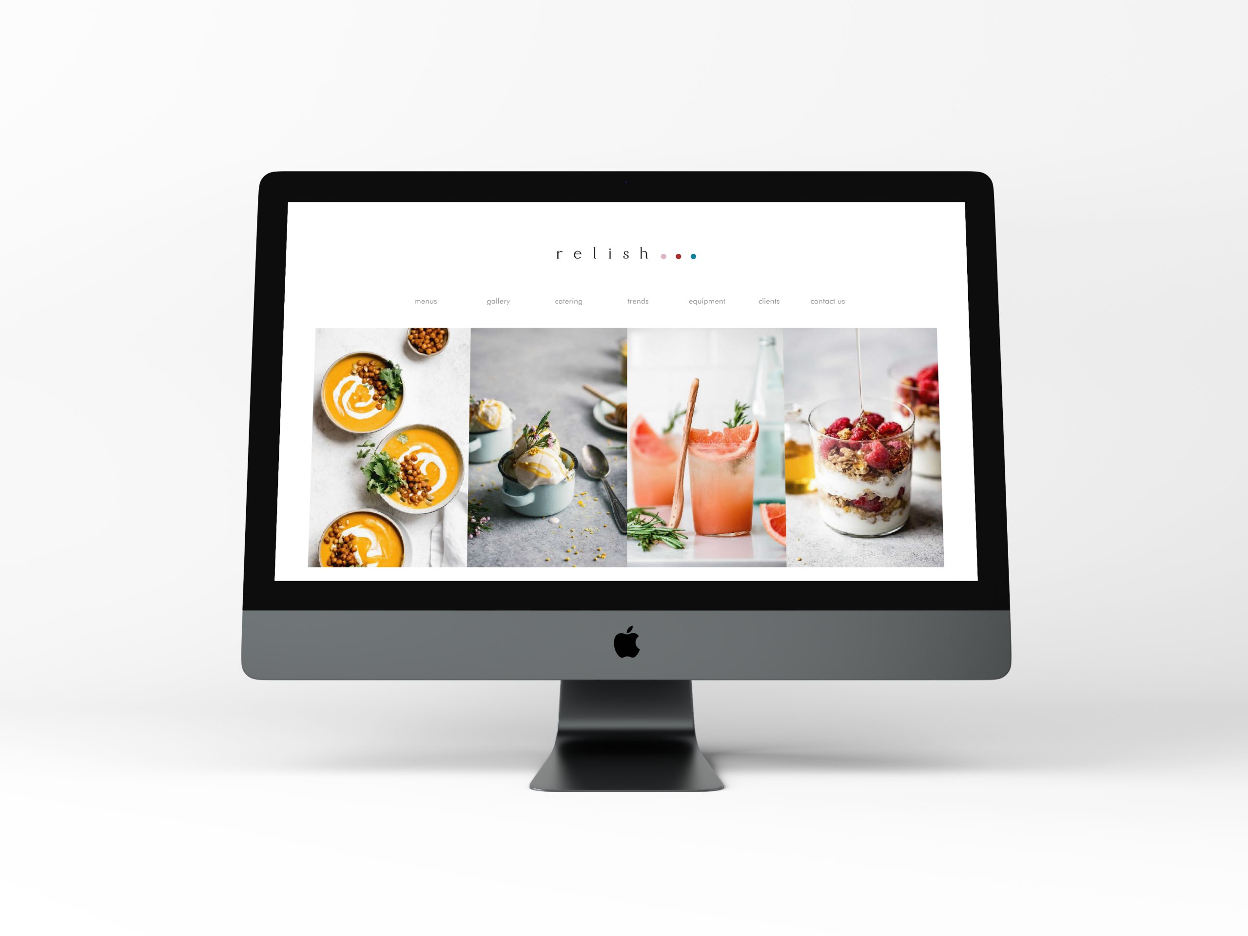
What can Relish bring to the table?
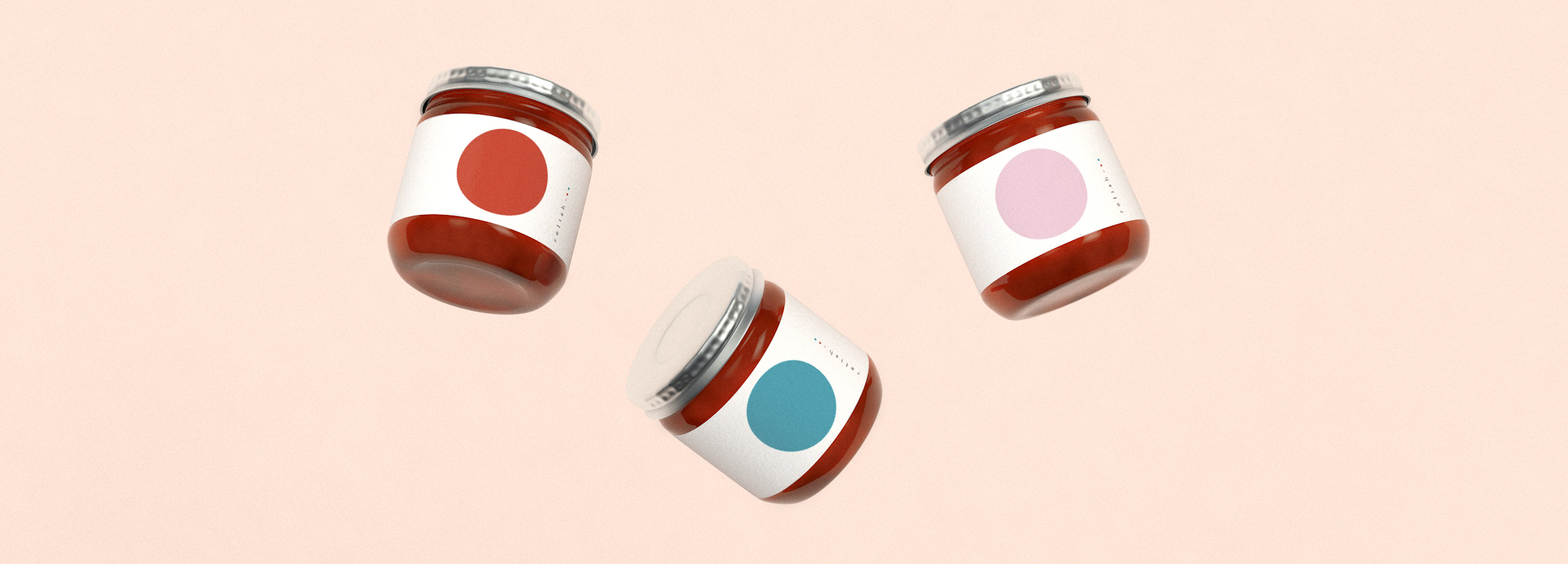
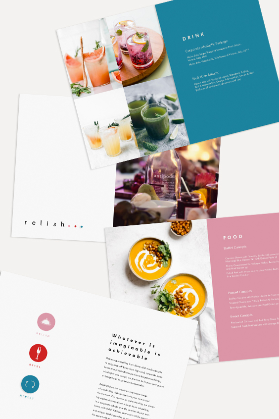
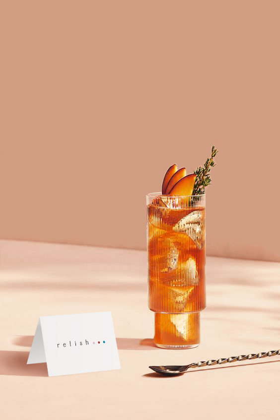
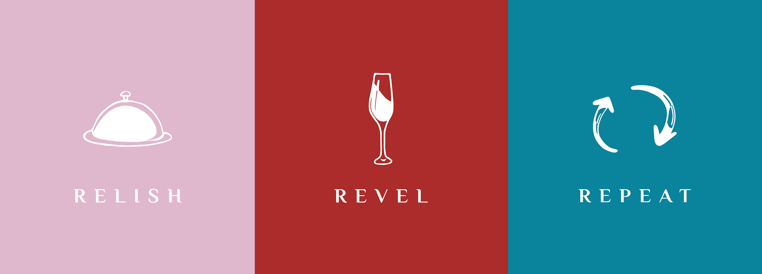
Flavours to savour, the merriment of coming together to feast, and of course… to do it again!". Our team of creatives came up with the tagline: Relish. Revel. Repeat. Three colour dots, captured in the “•••” of the logotype, open to creativity and imagination.
A fun-filled visual language
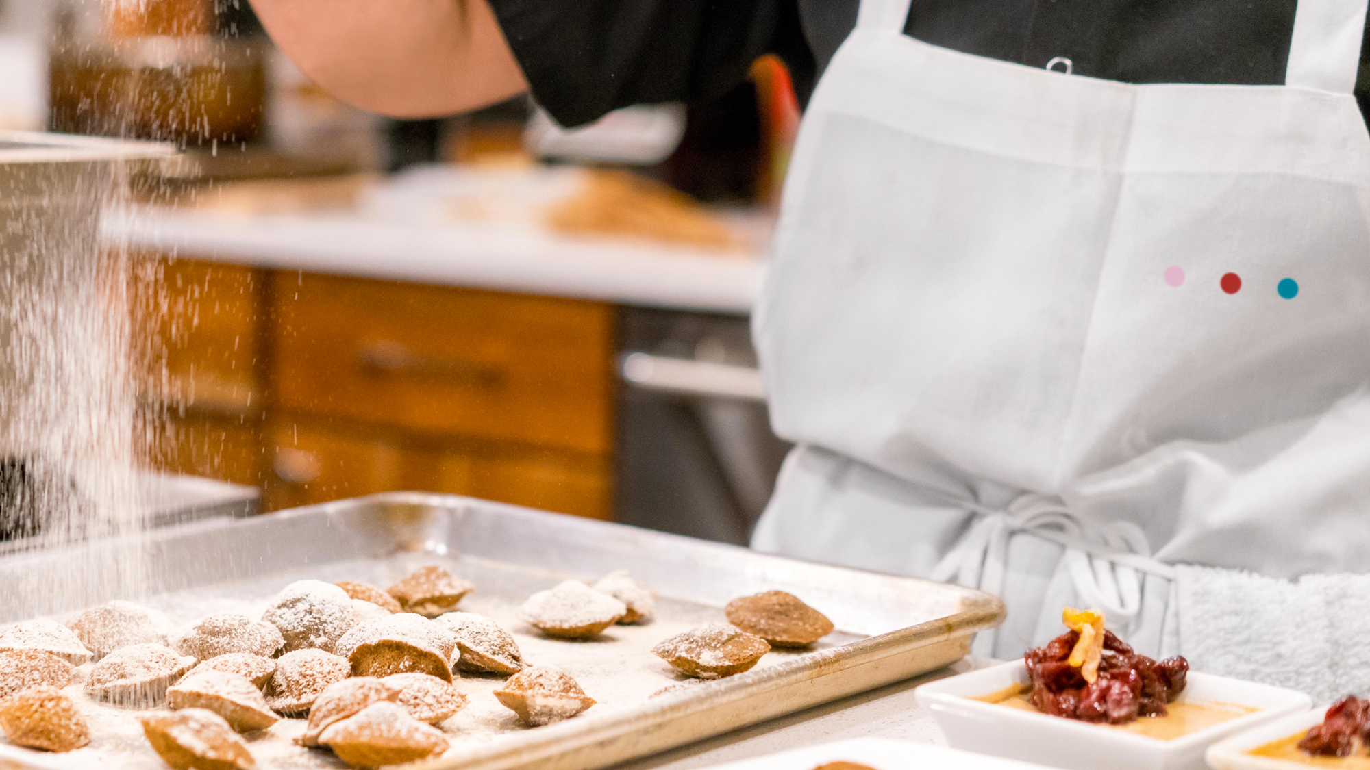
A table filled with colourful bites and canapés, vibrant confetti tossed into the air and dancing around the guests, drops of bright sauce decorating a dish, multi-coloured plates arranged on the table ... the logotype and visual identity are directly inspired by the joyful experience of a Relish event.