Tai Kwun Wayfinding
Spatial Strategy & Design
Centre for Heritage and Arts
Share
Service
Industry
The tale of Tai Kwun
In late 2011, we were appointed by the Hong Kong Jockey Club as creative partners on the Former Central Police Station ‘revitalisation’ project. Originally serving as a police station, prison, and courthouse during the British colonial era, the historic site was to be transformed into the city’s centre for arts and heritage – a vibrant, welcoming space for all. We crafted a unified wayfinding system that fuses the past with the future, preserving the historical importance of the complex while capturing the creative energy of the newly built JC Contemporary and JC Cube.
Unique sites come with unique challenges
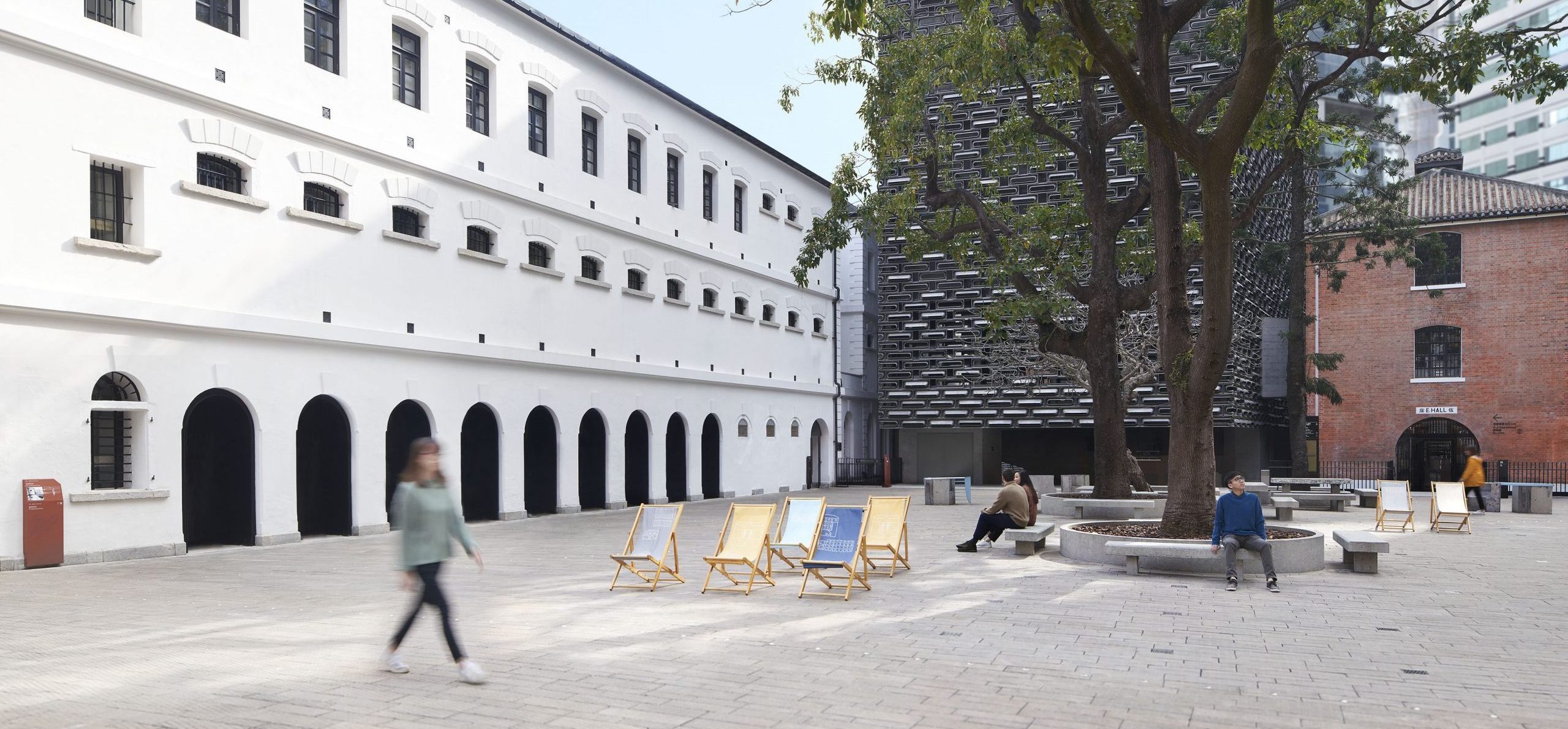
The unique nature of Tai Kwun posed several challenges for our team. Tai Kwun is a large-scale site spread across multiple levels. As the area was never intended for public access, the layout of the historic buildings is maze-like and confusing, with multiple entrances, gates, and passageways that make orientation difficult for visitors. Our team also had to work around various building restrictions due to the monument status of the buildings, which meant heritage elements had to remain untouched and kept in their original state.
A human-centric approach
To overcome these obstacles, we adopted a ‘human-centric’ approach to our spatial strategy, putting ourselves into the shoes of visitors to define potential journeys and identify areas for wayfinding support. We took multiple onsite trips to immerse ourselves in the space and fully understand how people would interact with their surroundings.
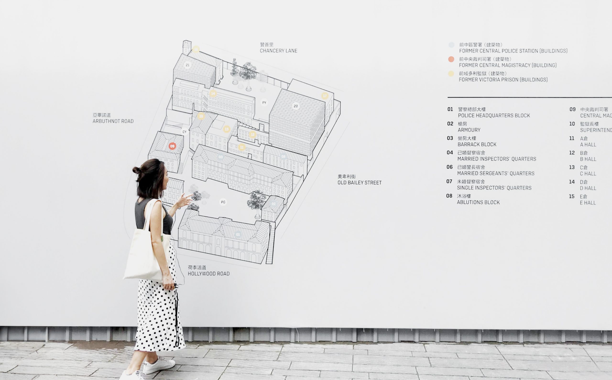
Photo by courtesy of Tomson Chan
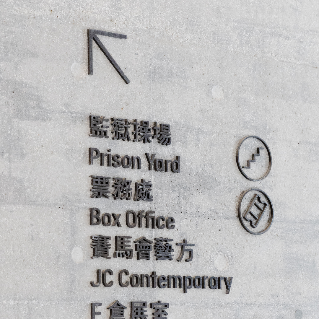
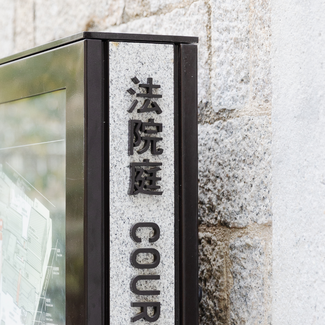
To honour Tai Kwun’s heritage, we ensured our signage design complimented the historical architecture while adding a timeless, modern twist, through our material choice, typeface, iconography and positioning.
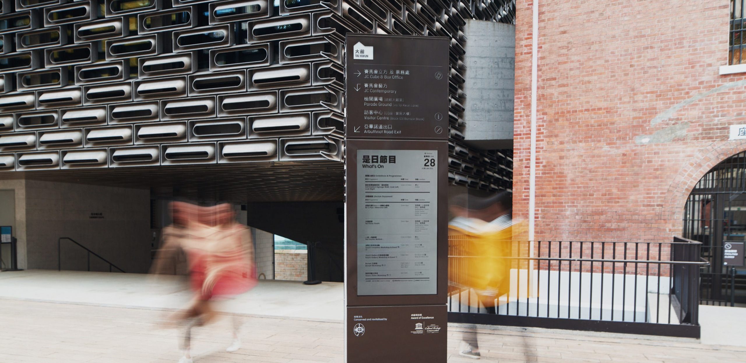
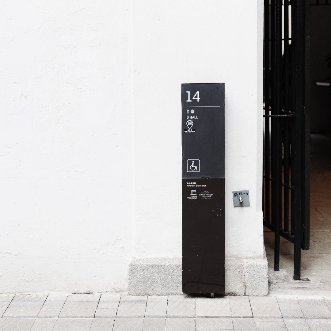
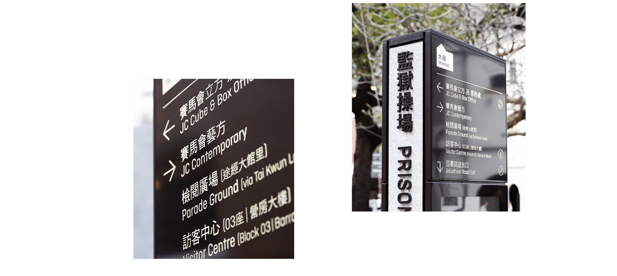
Every sign counts
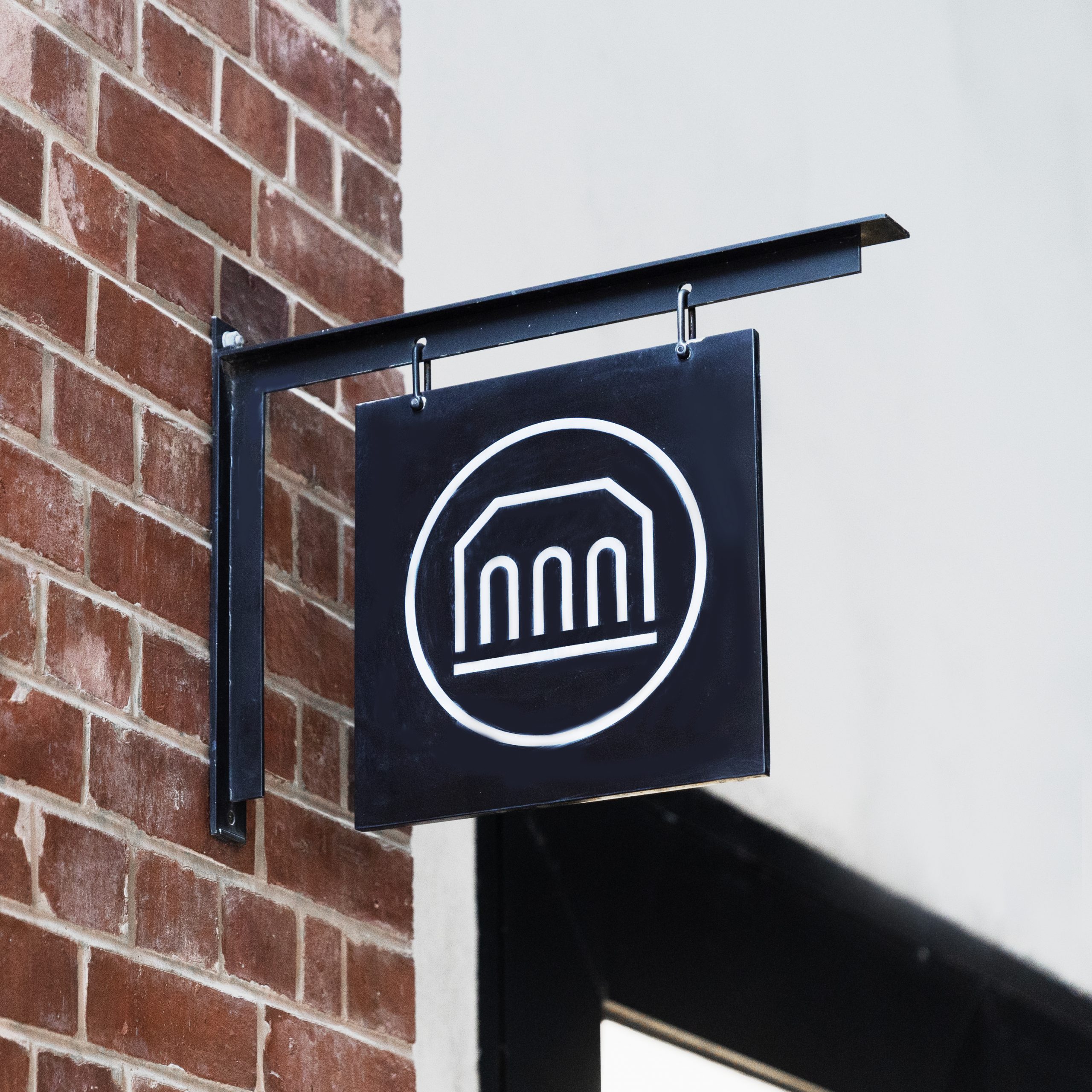
From modular totems to hanging signs, video screens and wall-mounted signs, we utilised a wide range of signage to cater to specific user needs at different spots around Tai Kwun. For instance, we used wall mounted signs at entrances to give visitors clear and quick directions to ensure a smooth start to their journey.
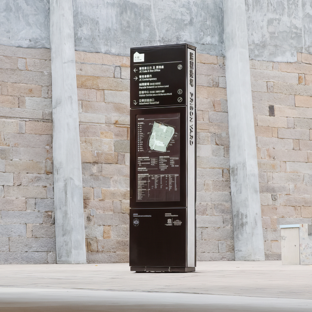
We also placed high-level totems at key destinations such as the parade ground and prison yard to highlight the significance of the space, capture the attention of visitors and provide easily accessible information.
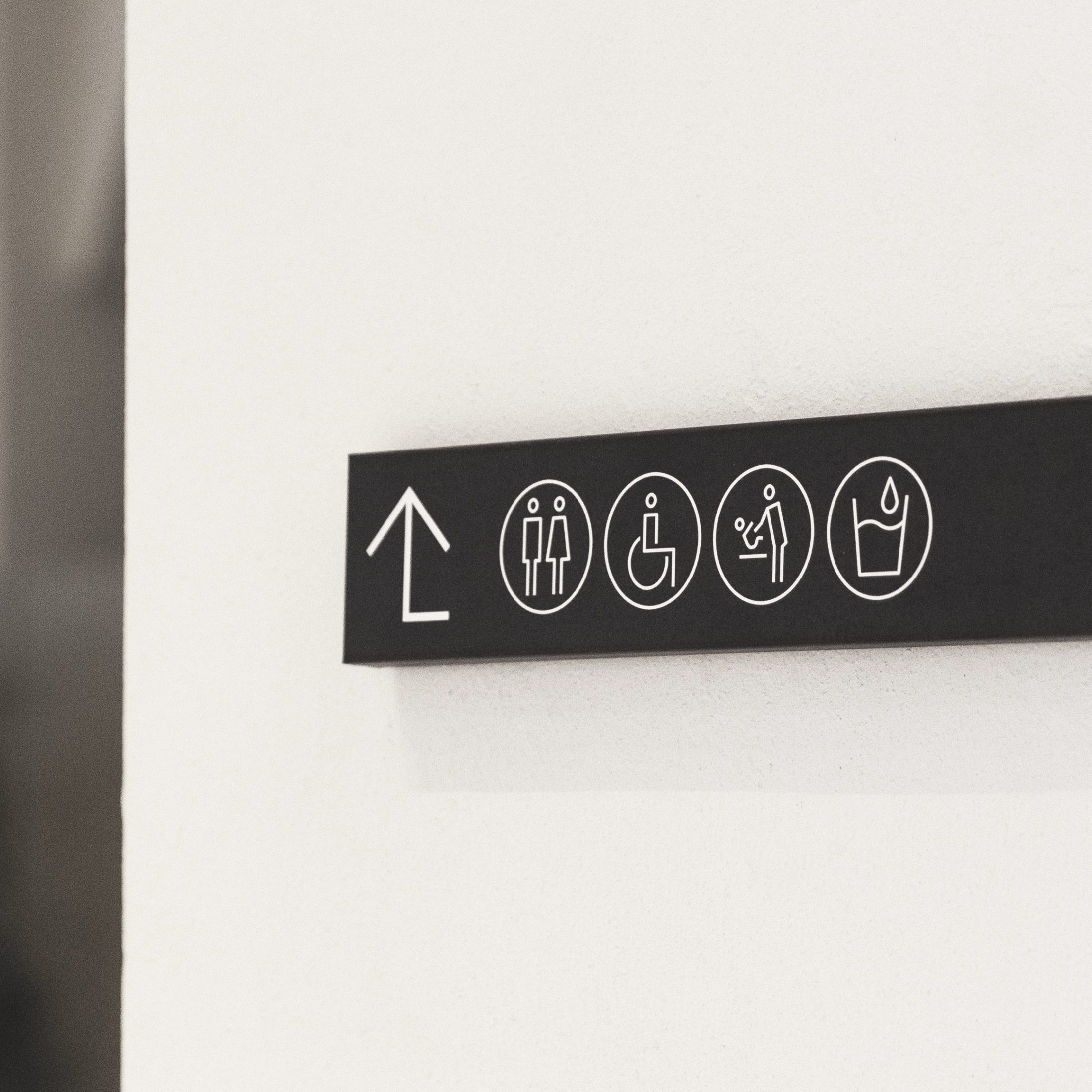
Attention to detail
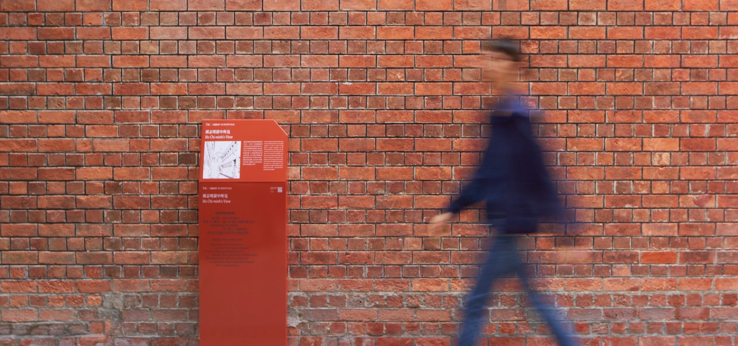
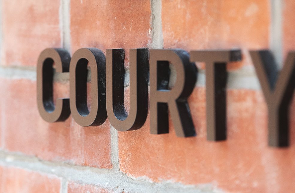
Most of our signage in Tai Kwun follows an elegant monochromatic palette of whites and blacks. We chose these colours to preserve the dignity of the site and enhance the timelessness of our wayfinding system. Some signage, including our story-telling signs, are a similar colour to the walls of historic buildings.
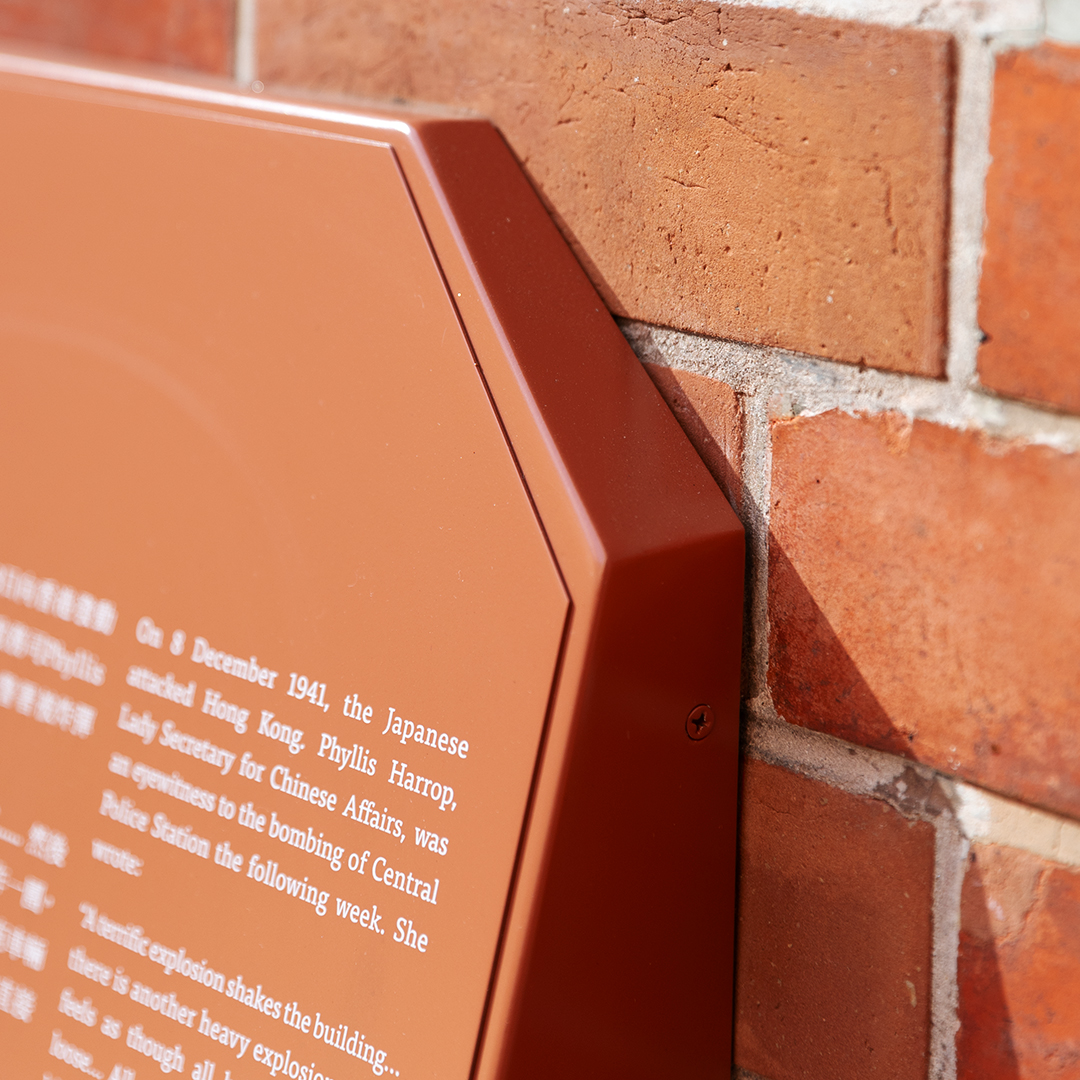
Inspired by the theme “if the walls could talk”, we intended for these signs to blend into the built environment and become part of the architecture.
For our modular totems, we introduced a block that mirrors the brick exteriors of the heritage buildings, to weave wayfinding with architecture.
We chose ‘San Serif’ as the typeface for all our signage for its friendly yet sophisticated style. This font is timeless and modern, helping to balance out and lighten up the rigidity of the historic site. The curves and structure of this typography also reflect architectural elements common throughout Tai Kwun, including arches, columns, windows and brick stacks.
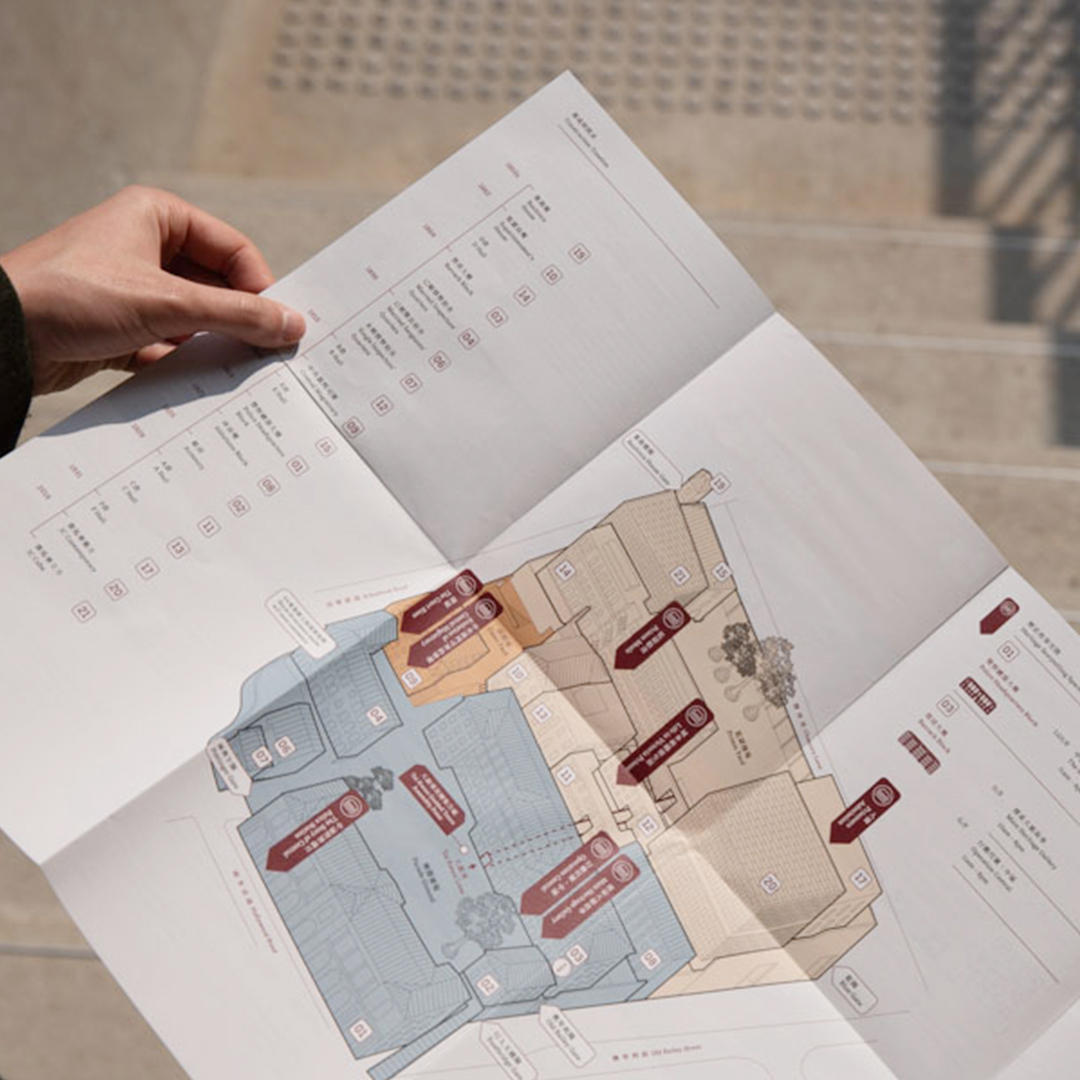
Mapping out the space
We designed an easy-to-use map for Tai Kwun so visitors could visualise and navigate through the space in an intuitive and smooth way. As Tai Kwun is a complex site with many different blocks, we divided the site into 3 different zones marked by different colours. We took a minimalist approach towards our key and additional icons to keep the map clear, legible, and allow sufficient negative space for viewers to look at the map without feeling overwhelmed.
Contemporary, minimal & refined
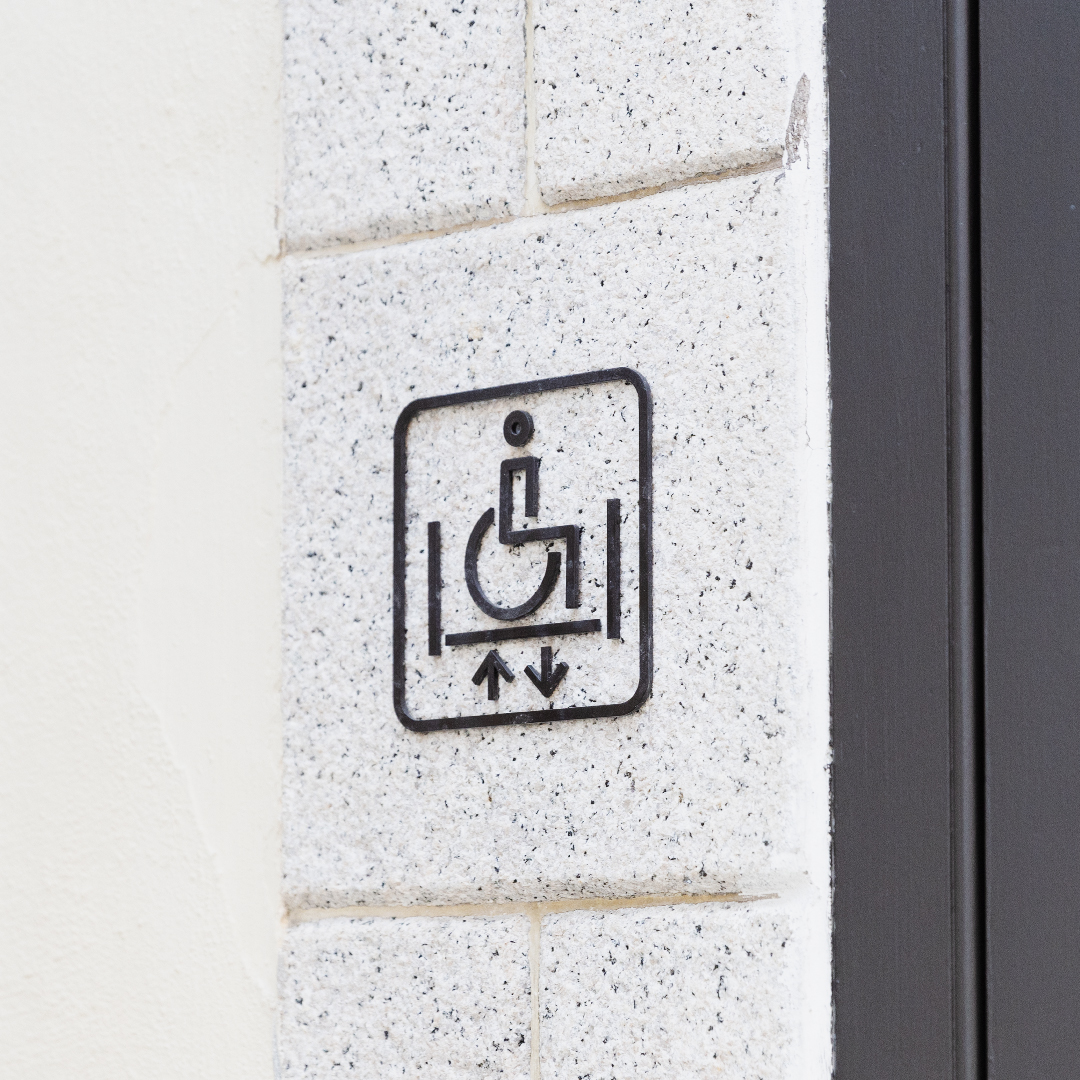
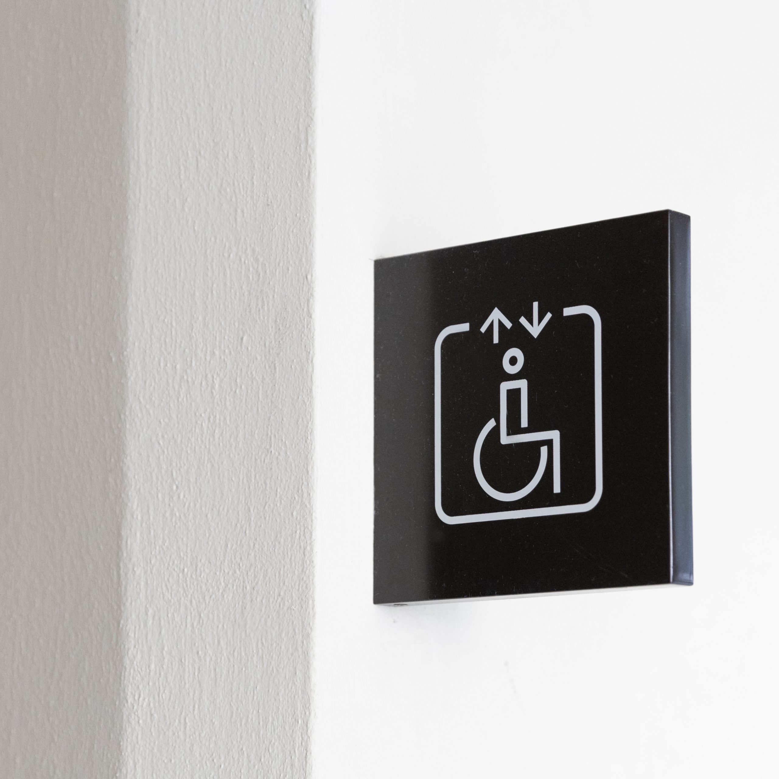
Our pictograms are inspired by the geometry and symmetry seen in Tai Kwun’s various heritage buildings. We used crisp and light strokes for a fresh and modern look to strike a balance with the rich history of the site.