Ontolo
Brand Strategy & Design
Share
Service
Industry
More than meets the eye
For their new development in Pak Shek Kok, Tai Po, Great Eagle had the vision to create a destination away from Hong Kong’s hectic urban rhythm, to offer a balanced lifestyle with excellent service standards. However, there was already a significant number of competitors focusing their communication on luxury living surrounded by nature and sea view, hence the need to find a new angle.
Personal and emotional connections
We saw an opportunity to create a brand with a personal and emotional approach, moving away from mere premium offers; and focusing instead on personal comfort and self-expression, rather than social status.
Self-expression, rather than social status
We positioned the development as an alternative urban lifestyle for independent minds, with a space to expand their horizons, nurture their potential and refine their sense of identity. Understated, progressive and mindful.


We positioned the development as an alternative urban lifestyle for independent minds, with a space to expand their horizons, nurture their potential and refine their sense of identity. Understated, progressive and mindful.


Infinite fluidity
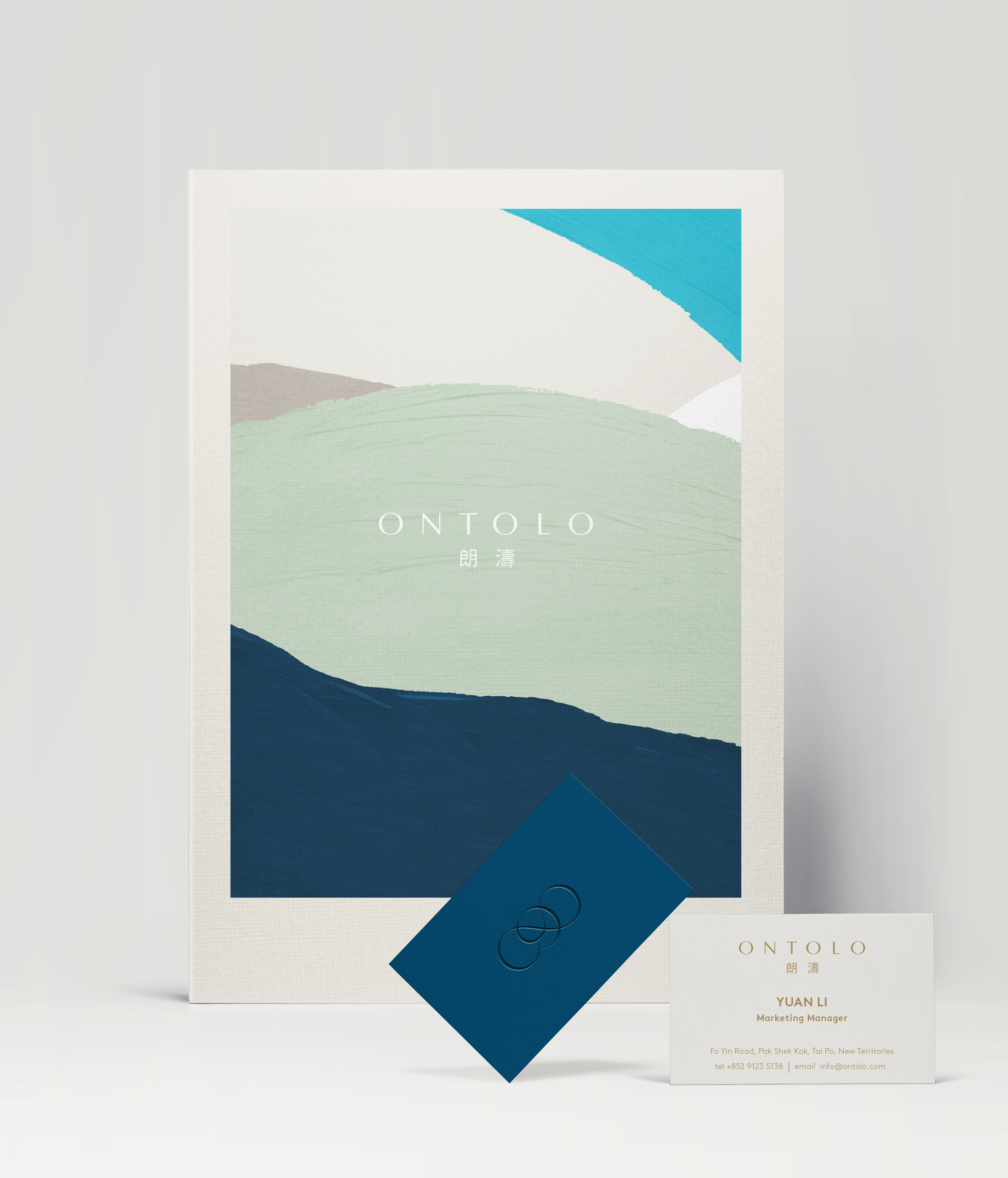
ONTOLOGY + TOLO HARBOUR. What’s in a name? Only a perfect coincidence of literality and philosophy. The three O’s of the name ONTOLO are linked in a fluid logo mark inspired by the continuous transformation of water, an allegory to the progressive journey of life, the constant flux of energies.
The soft and peaceful colour palette as well as the wavy brush stroke pattern are directly inspired by the nature surrounding the development.


