TAI KWUN – Heritage Programme
Brand Strategy & Design
Share
Service
Industry
Photos Courtesy: Guy Bertrand
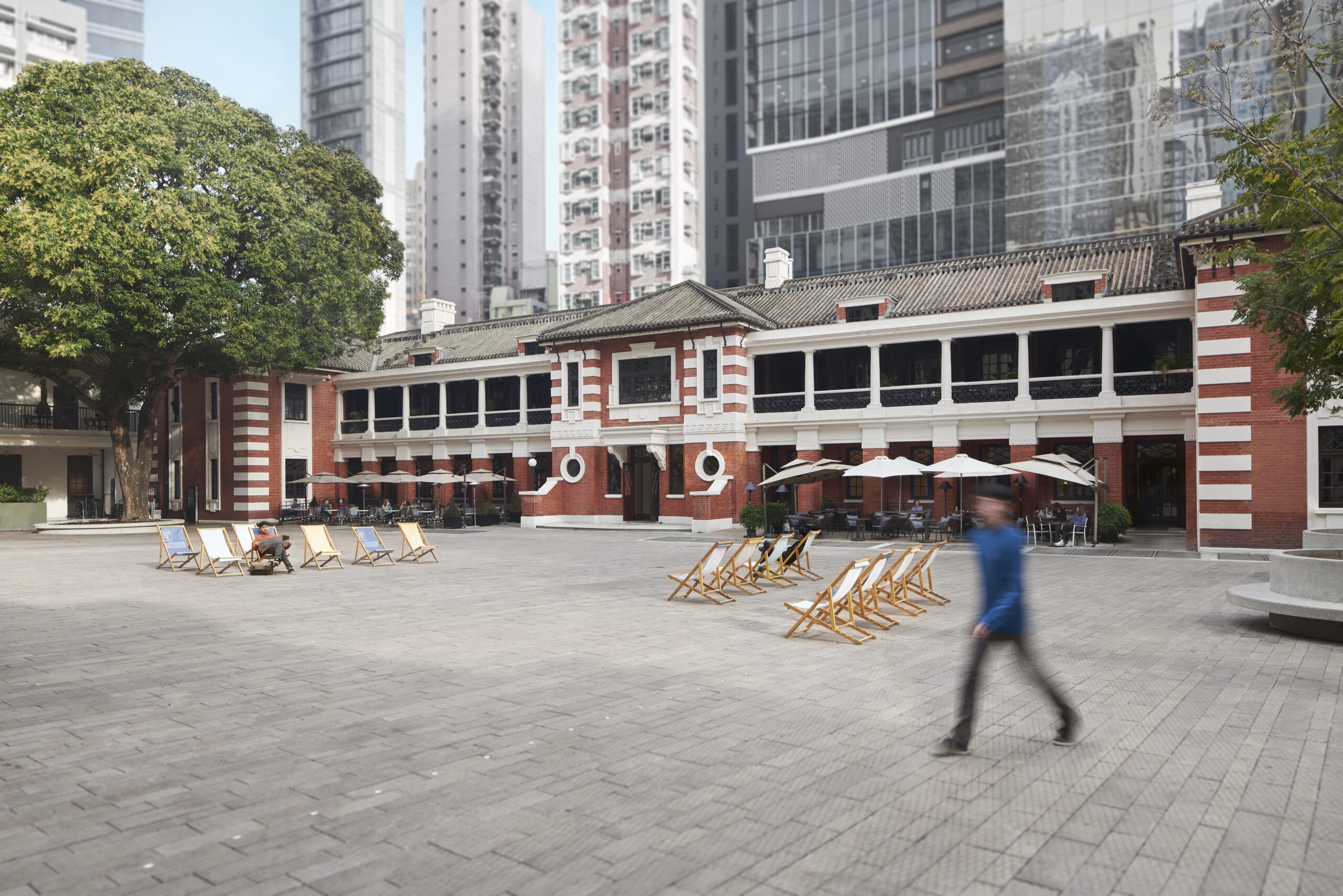
The fruit of a collaboration
Off the back of our continuous work with Tai Kwun for the past eight years, we were approached to help create a secondary brand for them, which would both section off and emphasise their Heritage Programme. The programme would consist of eight different offerings, which needed to each be identifiable, and have a consistent visual language throughout that could be implemented in a flexible manner.
Ripe for opportunity
The main challenge was to stick to our previously implemented guidelines, which we had established whilst doing work for the original Tai Kwun revitalisation project, while also creating a distinct enough layer to distinguish the Heritage Programme. Our design team saw this as a great opportunity to strengthen a graphic language that already existed, but only in souvenirs and in the Tai Kwun shop.
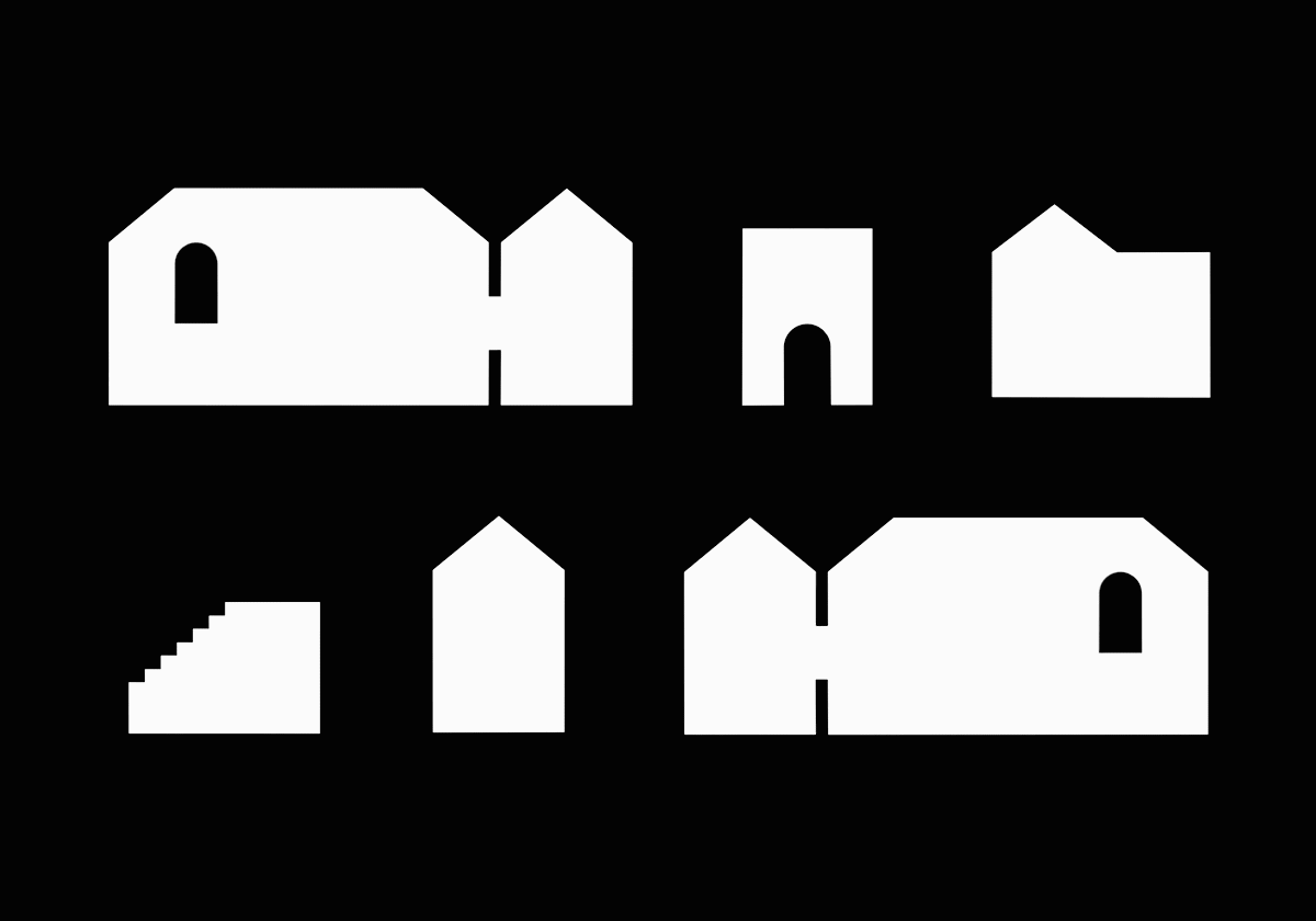
From 2D to 3D
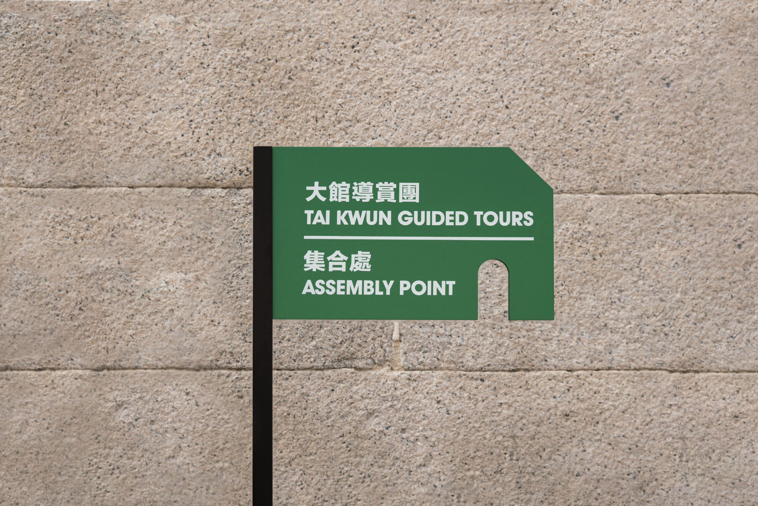
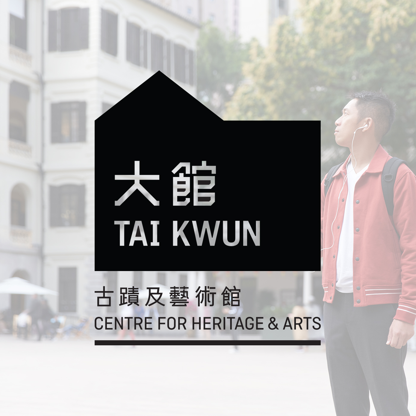
We needed to remain consistent with the overall Tai Kwun visual identity, whilst adding an easily discernible layer to the visuals. Our inspiration came from the names of the heritage buildings in Tai Kwun: the Barrack Block and the Police Headquarters’ Block. We took the flat shapes that we had originally created in 2017 and gave them a unique twist — bringing them to life by giving them depth. In this way we achieved our goal in creating an identity that is automatically recognisable, but that sets itself apart from the existing Tai Kwun visual language.
With our series of 3D building shapes, we were able to construct a block “village”, and created multiple scenes by changing the view and composition of the building blocks. We created a picture library of the different Heritage Offerings, and used them along side the 3D key visual.

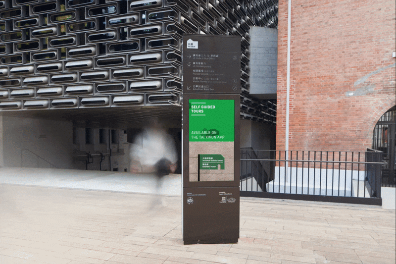


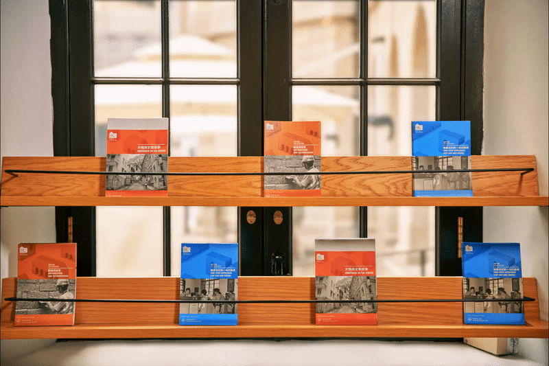
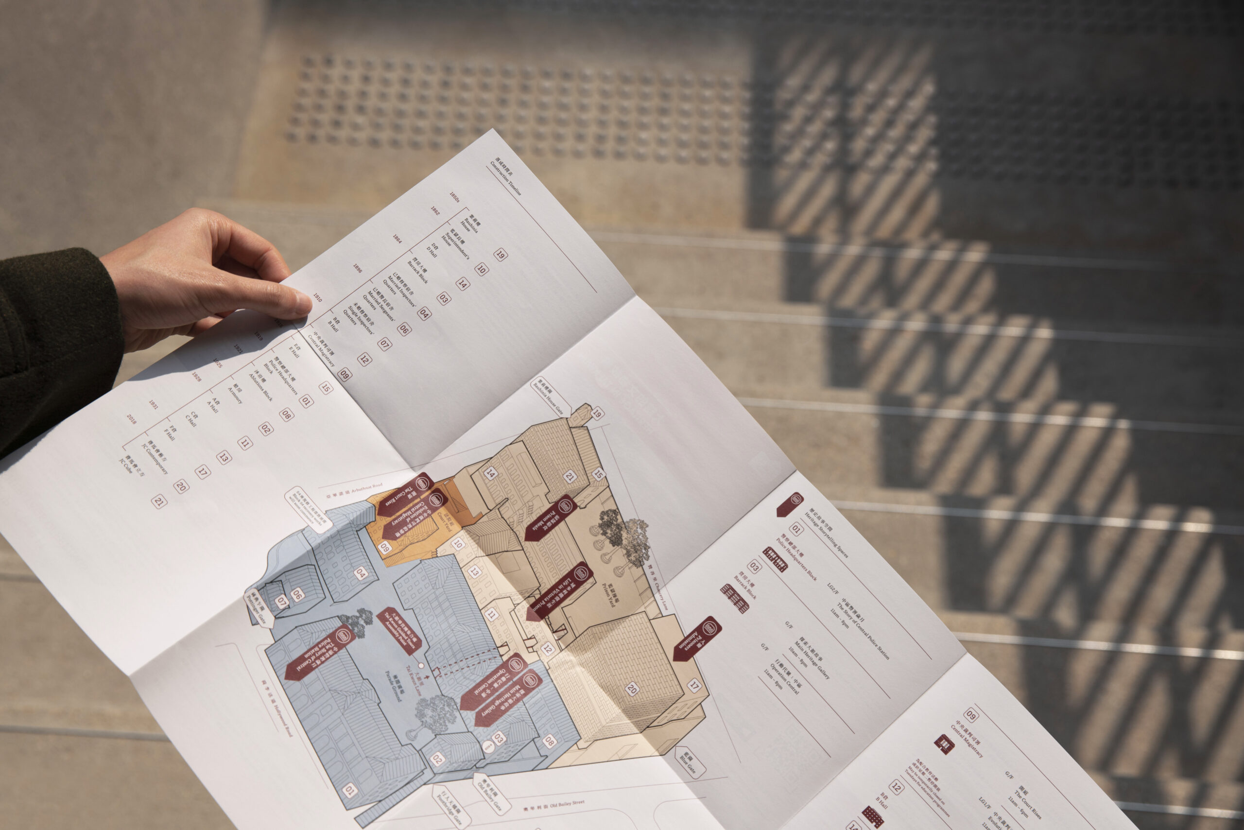
Our team implemented the visual language throughout the site amenities. Four program leaflets were updated with the new Tai Kwun block key visual. These were an opportunity to apply the block principal to a printed material. Using Die-cut technique, we shaped the leaflet to echoe with our block visual language.
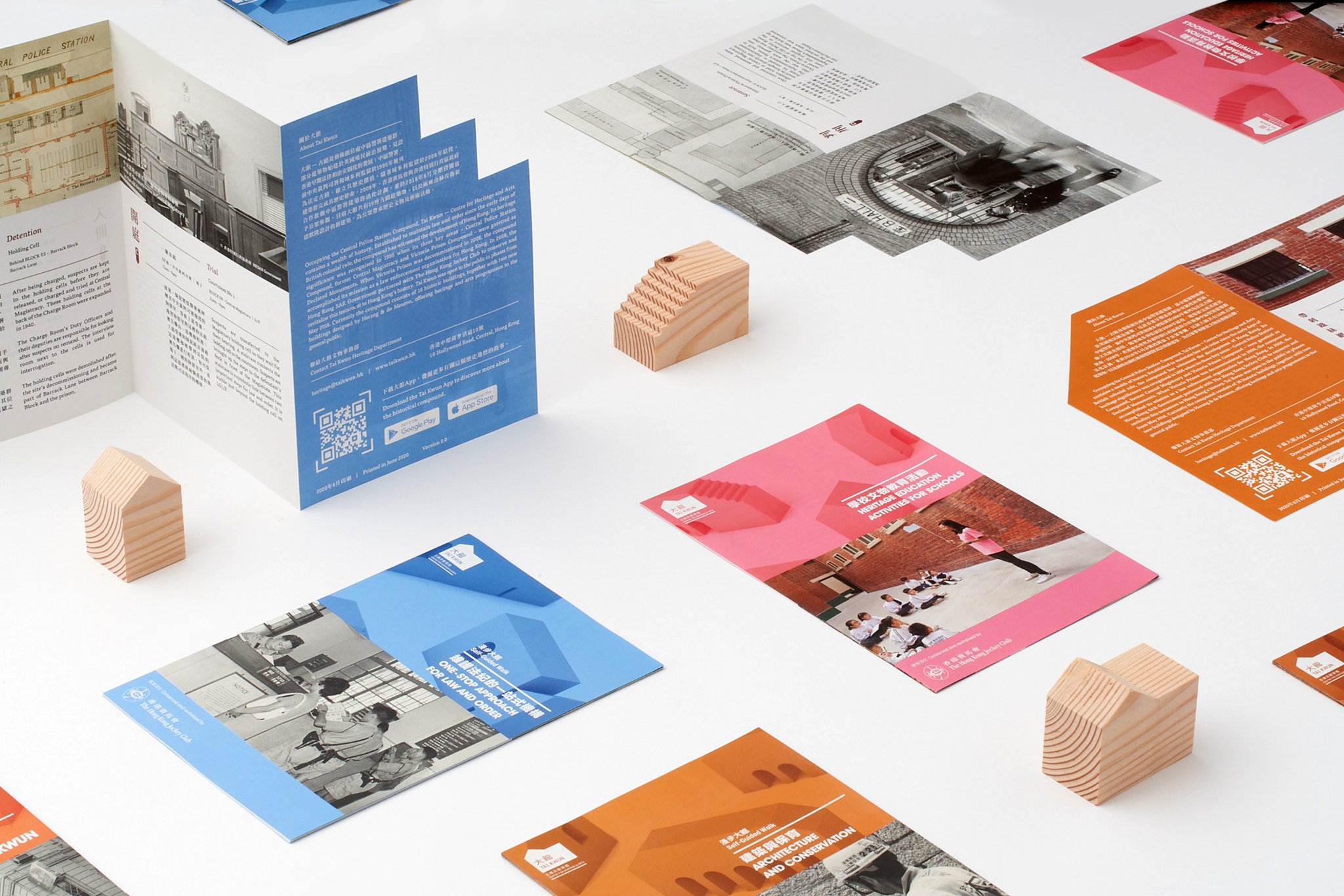

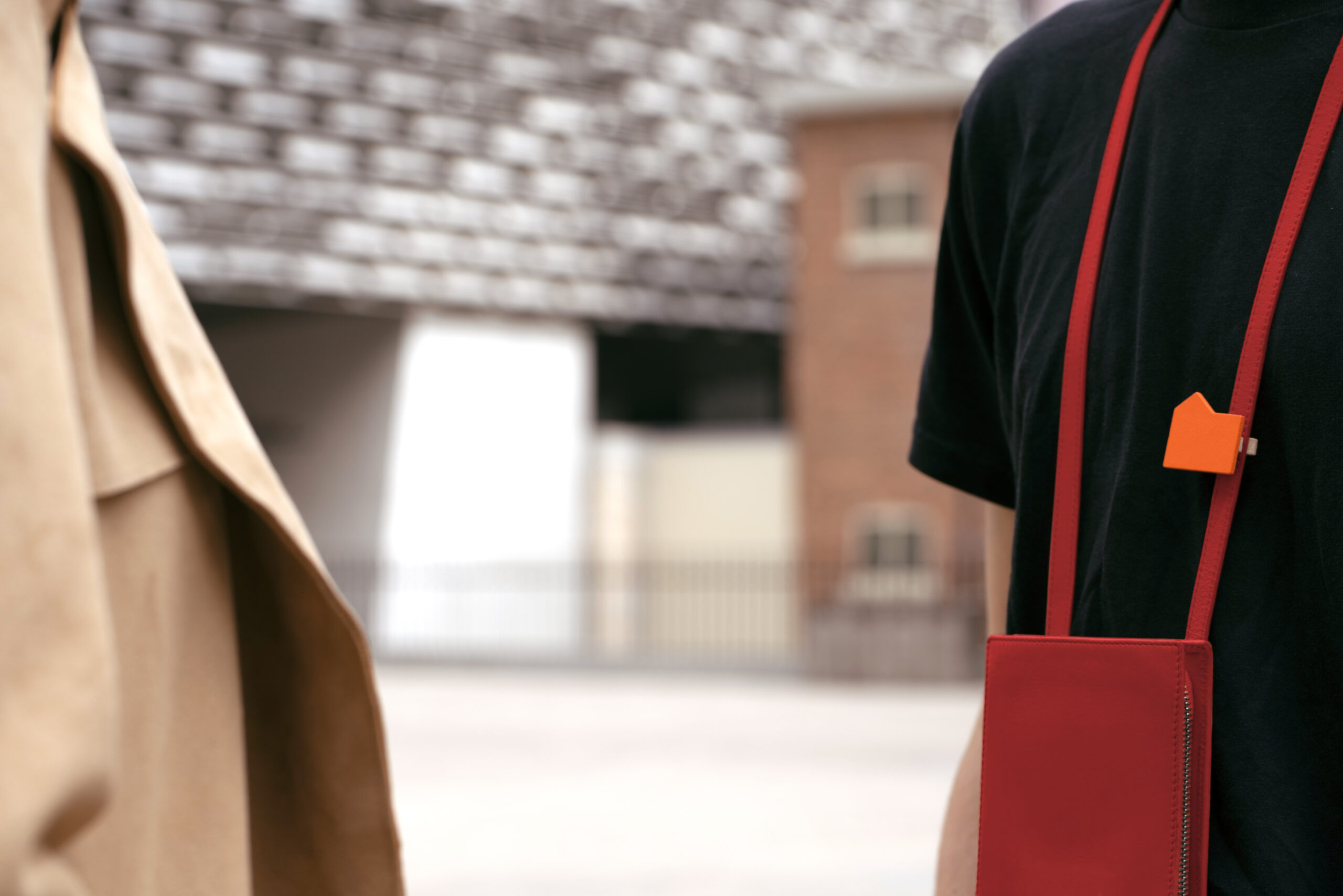
To strengthen the visual identity, our designers used the building shapes to create Tour-Visitors identification wooden pins. Coloured in the three official Tai Kwun colours, they are a whimsical & sustainable souvenir. For a consitent experience, the tour assembly point sign is also designed in the same shape.