Tai Kwun
Brand Strategy & Design
Centre for Heritage and Arts
Share
Service
Industry
Photo courtesy of Tai Kwun, The Hong Kong Jockey Club CPS Limited
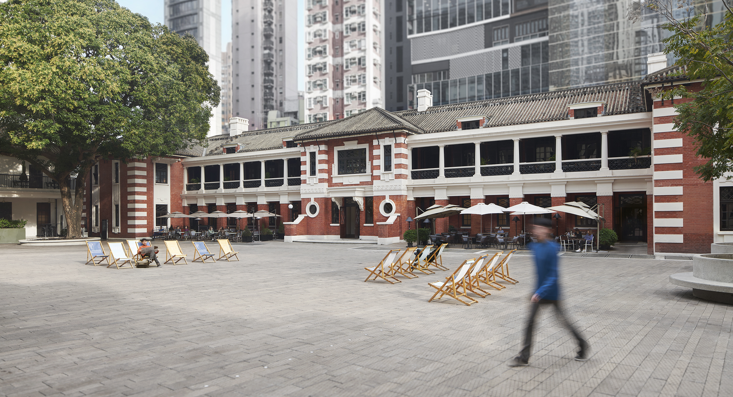
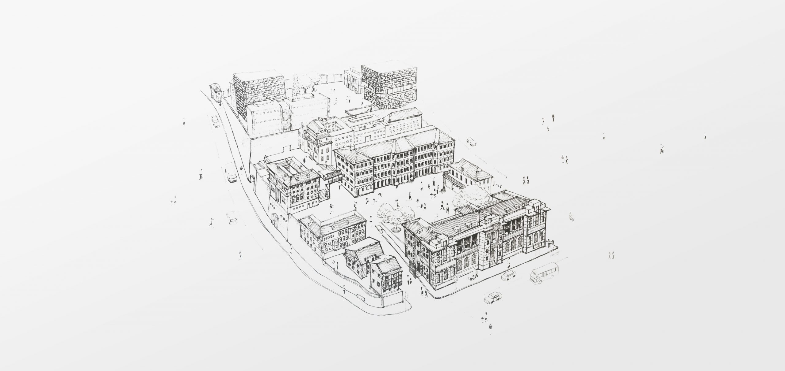
A new benchmark for heritage conservation
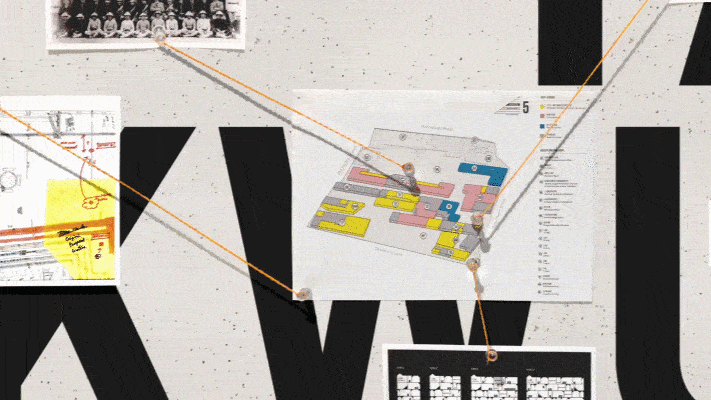
In late 2011, Marc & Chantal was appointed by the Hong Kong Jockey Club to be creative partners for the Former Central Police Station revitalisation project. Our team was entrusted with the formulation of an original experience model, overall vision, brand strategy, name and visual identity. Our scope was later extended to a comprehensive Brand Identity and Experience Design program, including a multi-layered wayfinding scheme, site-wide heritage interpretation, all permanent narrative environments and exhibition spaces, a visitor centre and a shop.
Unwavering commitment
Our teams embarked on what would be a six-year long journey with the firm intention to never lose sight of the bigger picture. We were keen to help establish high level strategic identity branding objectives and to project a strong, unifying vision that could be embraced by all. In this respect, the unanimous consensus achieved in the initial strategy phase was instrumental in managing the complexity inherent to this scale of identity and experience project on the long term. It meant that our teams could refer back to the core mission at any point in the creative process, to support the rationale, and assist the project team both with their internal and external communication needs.
The brand is the experience, and the experience is the brand
We analyzed and interpreted findings from an initial stakeholder engagement exercise, alongside a comprehensive benchmarking of both local and international cultural venues. Through this exercise, we were able to formulate an original, innovative experience model in which heritage, arts and leisure are creatively integrated.
“We envisioned an environment that naturally stimulates conversations between people from different walks of life, across cultures and generations.”
Fusing the past and the future
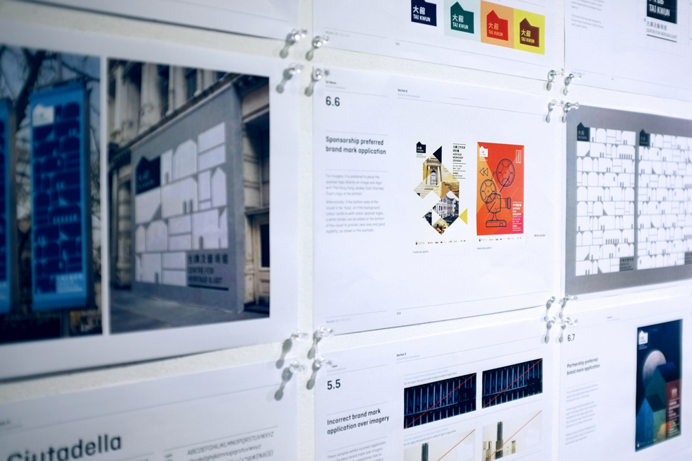
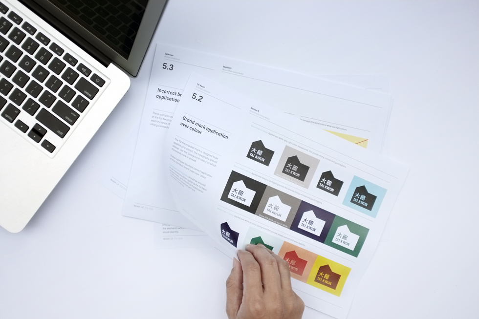
We created a simple yet memorable logomark by fusing the pitched roof of the heritage buildings with the cubed shape of the new buildings designed by Herzog & de Meuron. For non Chinese-speakers this approach helps visually identify what the brand name stands for. Indeed, the name [大館] ‘Tai Kwun’ is a term that was once used colloquially amongst locals to refer to the Central Police Station compound, and translates literally as ‘Big House’.

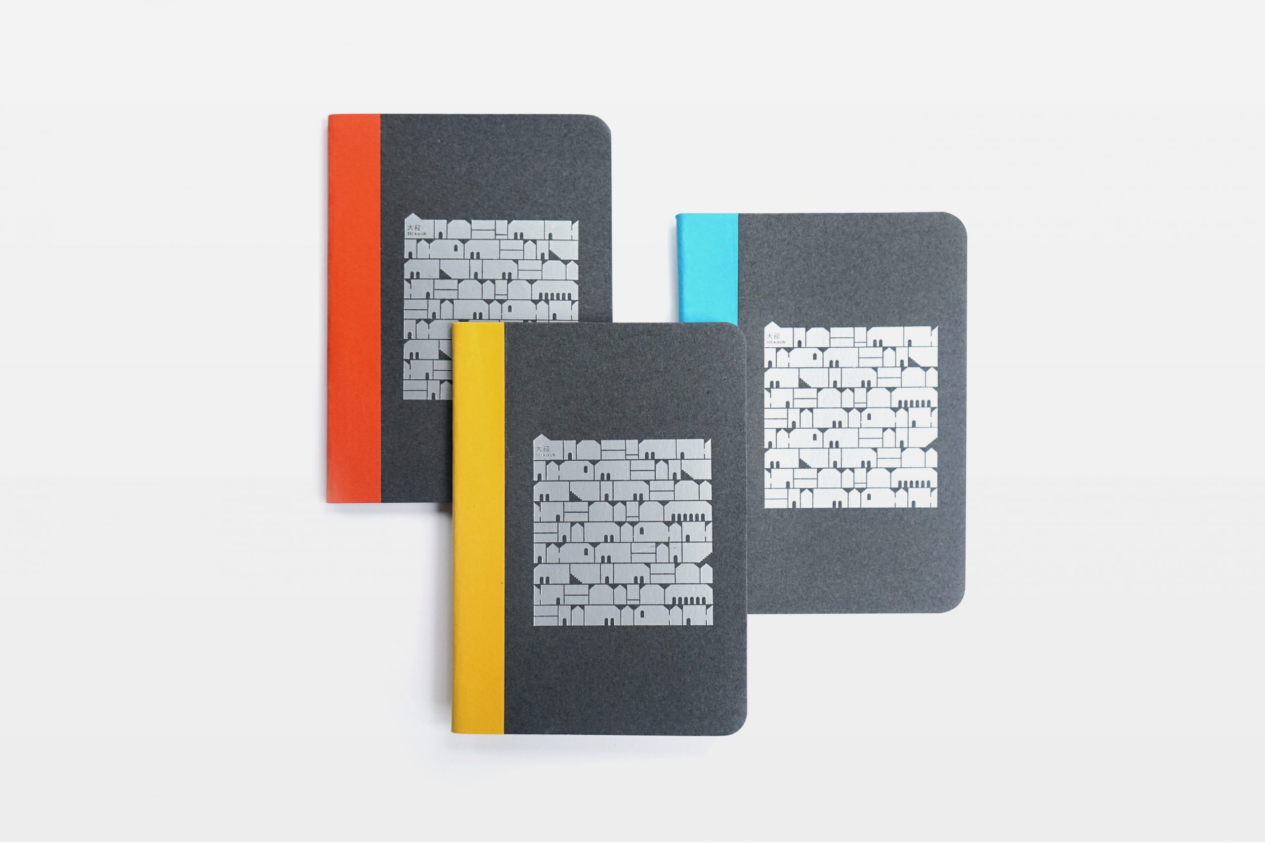

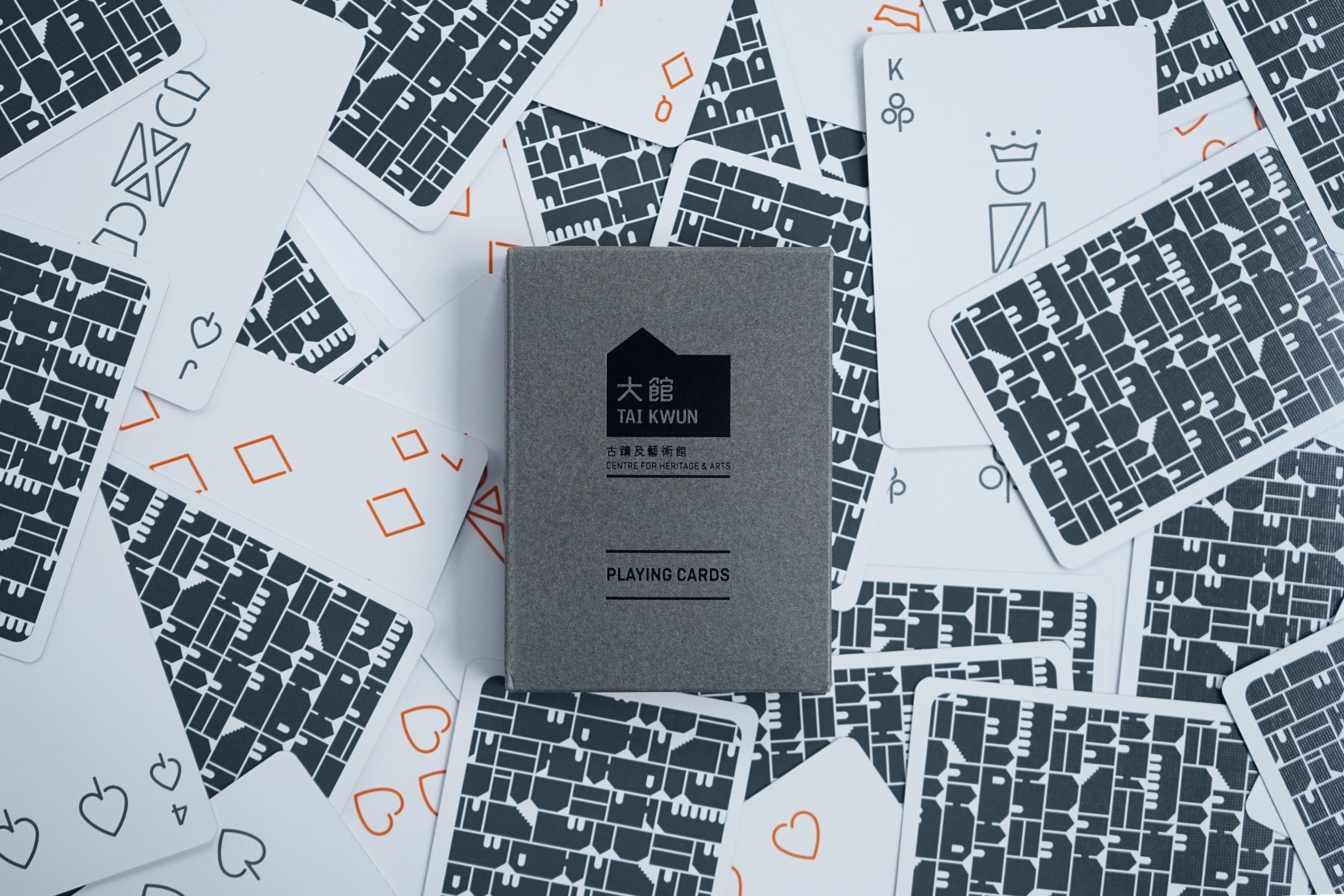
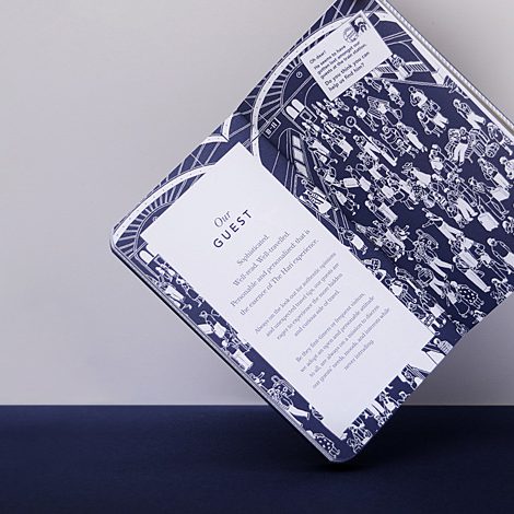
A Playful Twist
Designed like an alphabet of architectural blocks, this pattern playfully hints at the village-like atmosphere of Tai Kwun, and at the iconic bricks found throughout the site. It acts as a visual narrative, transcending cultures, languages and age barriers. Like toy wooden blocks it symbolically represents a modular experience that can be designed by the users themselves, and reinvented every time they visit. Tai Kwun’s retail design team readily adopted it for merchandise now sold at the Tai Kwun shop.
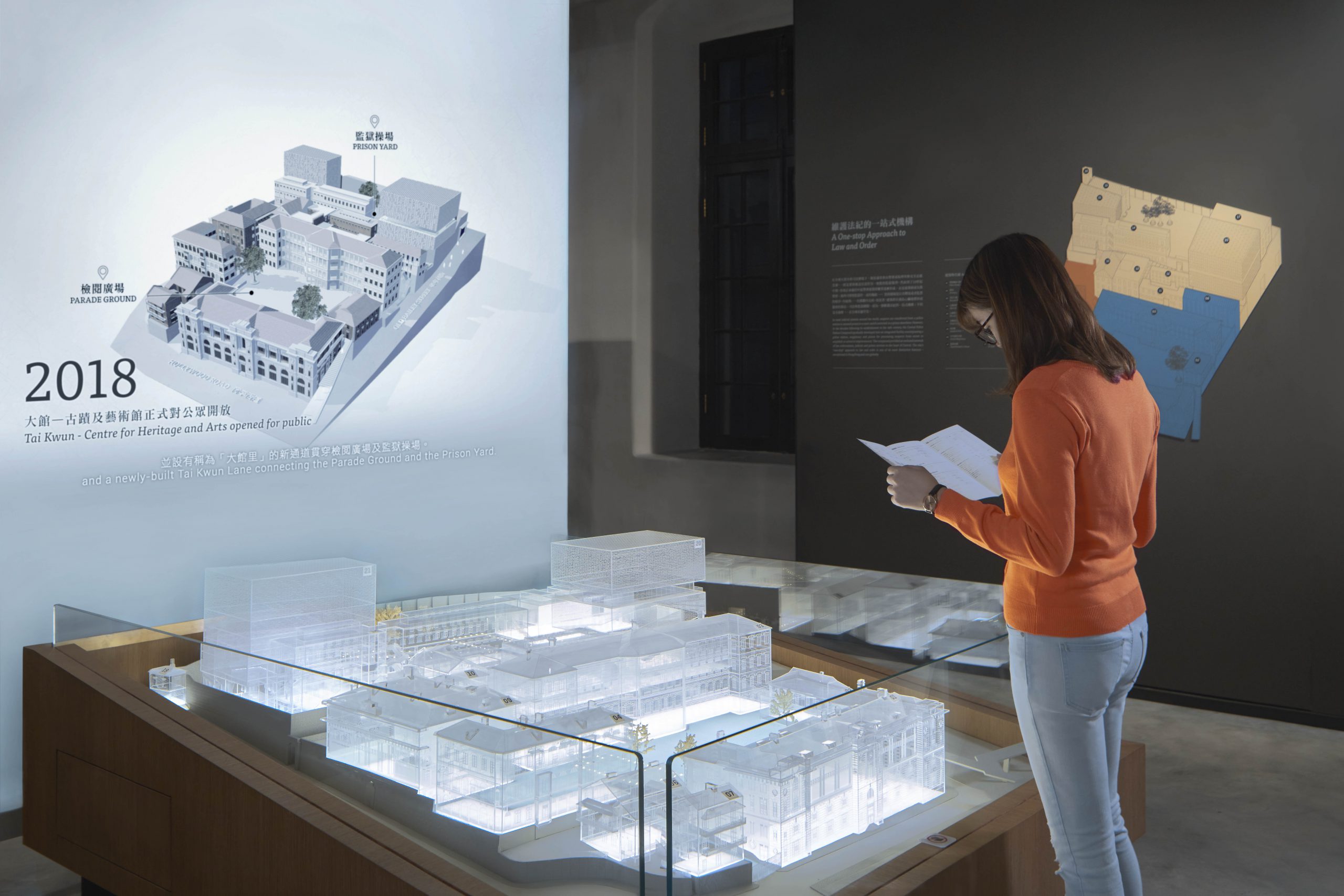
Heritage interpretation
Our team also took a keen interest in the content development aspect of the project. Through close collaboration with the Heritage Team at Tai Kwun, we created permanent exhibitions that tell the story of the Central Police Station compound.
“We explored on-going research, contributed our own findings, assisted with iconography, developed narratives and interpretation techniques, and fully immersed ourselves in the curation process.”
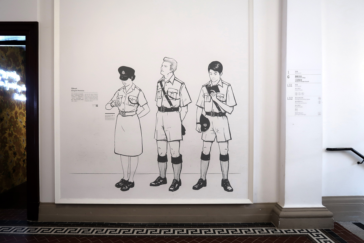
Creative Collaborations
We worked closely with other creative contributors, including audio and video production artists, model makers, and prop artists among others. For the storytelling murals found throughout the site, we collaborated with local urban sketcher, Noble. We chose this artist in particular because we fell in love with the ‘from life’ look and feel of his sketches, which are not overly stylized or polished.
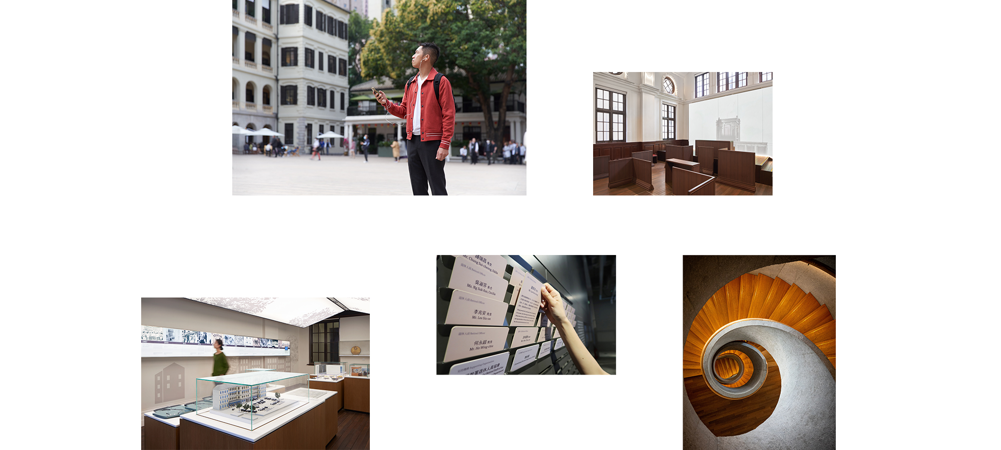
A seamless experience
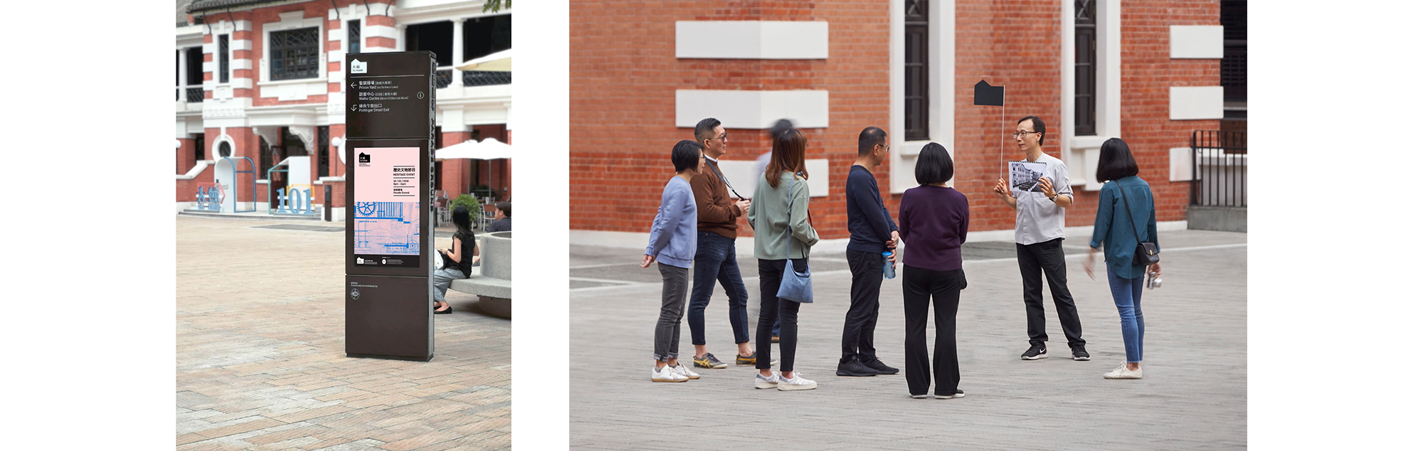
Our way-finding and branding teams worked together to provide a seamless experience for Tai Kwun visitors. We adopted an elegant, understated design language that suits the dignity of the site, and complements the various architectural fabrics.
Strategically located totems indicating the location of each Point of Interest work hand in hand with smaller signs placed along the visitor’s path: building names, hidden anecdotes about the site, mobile signage, etc.
“The design scheme acts as a modern layer seamlessly connecting heritage buildings and contemporary architecture, permanent exhibition spaces as well as way-finding or interpretive signs and furniture.”