LUCCIOLA – by The Hari Hong Kong
Brand Strategy & Design
Share
Service
Industry
The Hari comes to Hong Kong
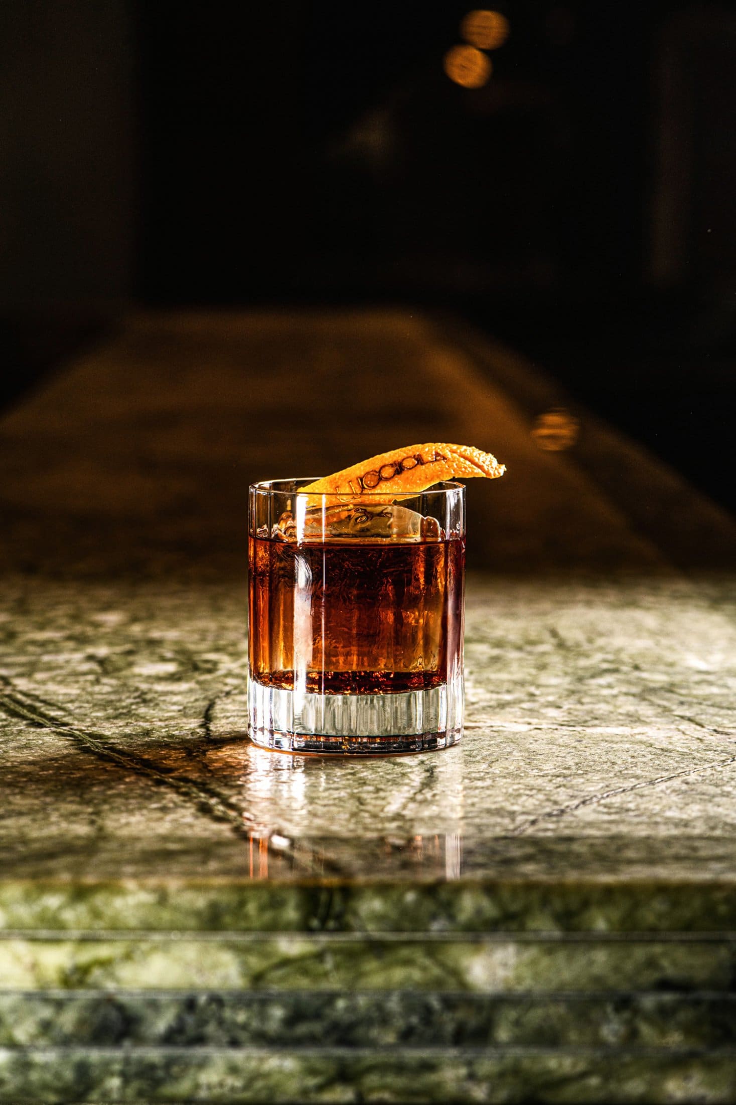
As The Hari Hong Kong prepared to open her doors to the public, the team at The Hari also wanted to offer F&B options to guests and visitors. The first floor restaurant is an Italian restaurant that offers all-day-dining and breakfast in the lounge. The interior is distinctly European, with a large marble bar, and iconic tiles, designed by Tara Bernerd.
A breath of affability
The most crucial aspect of the Harilela group is to bottle the warmth that our friend Aron Harilela exudes himself and infuse it into every aspect of the Hotel, restaurants included. With this in mind we set out to create Lucciola.
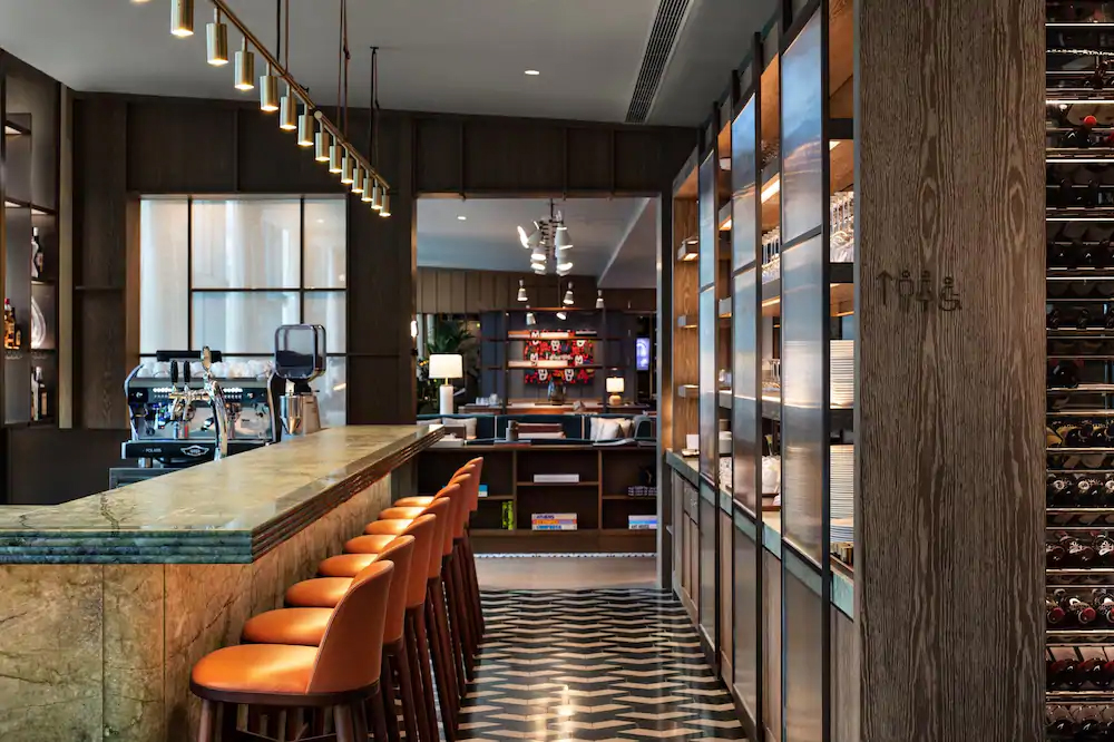
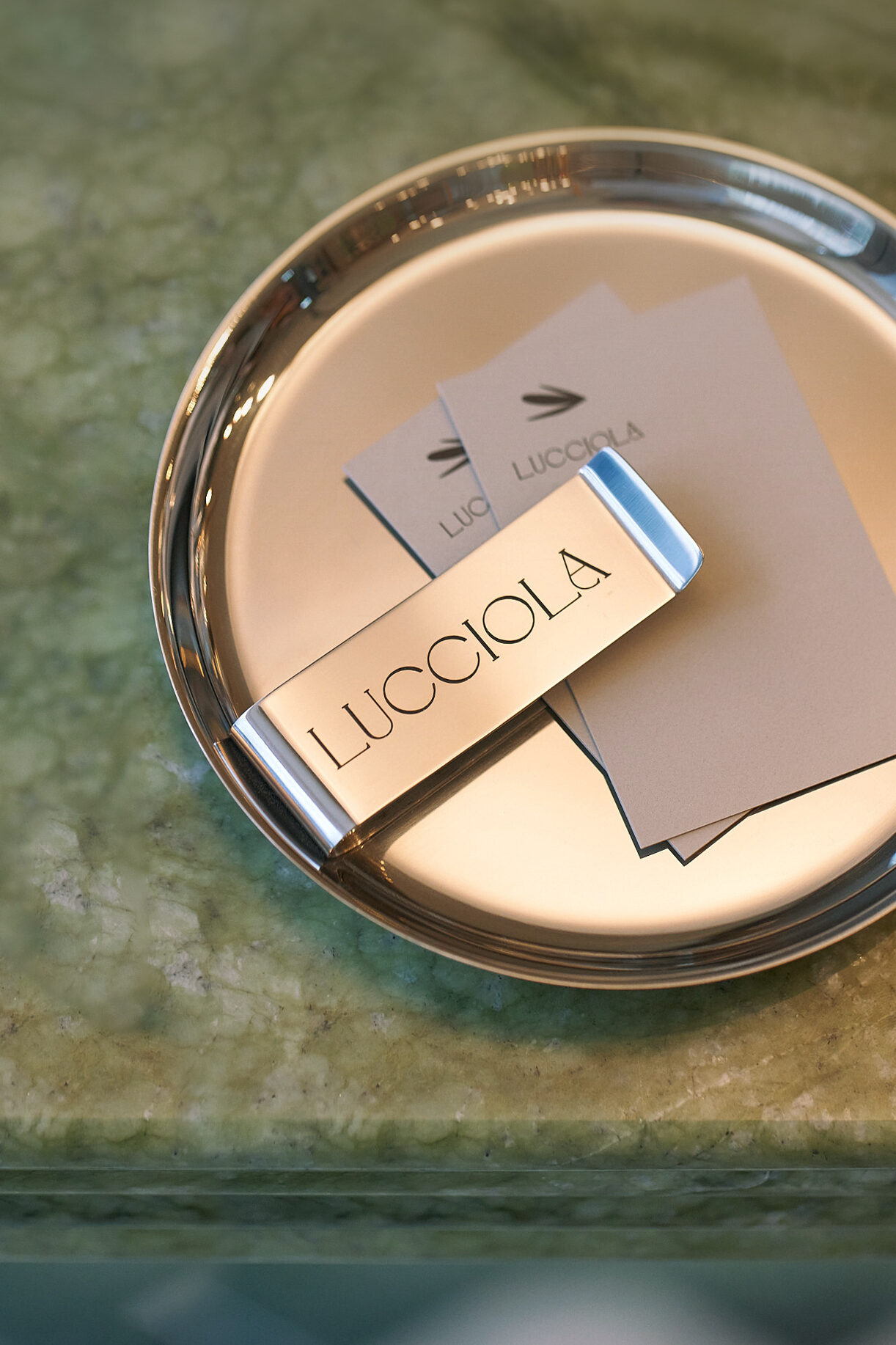
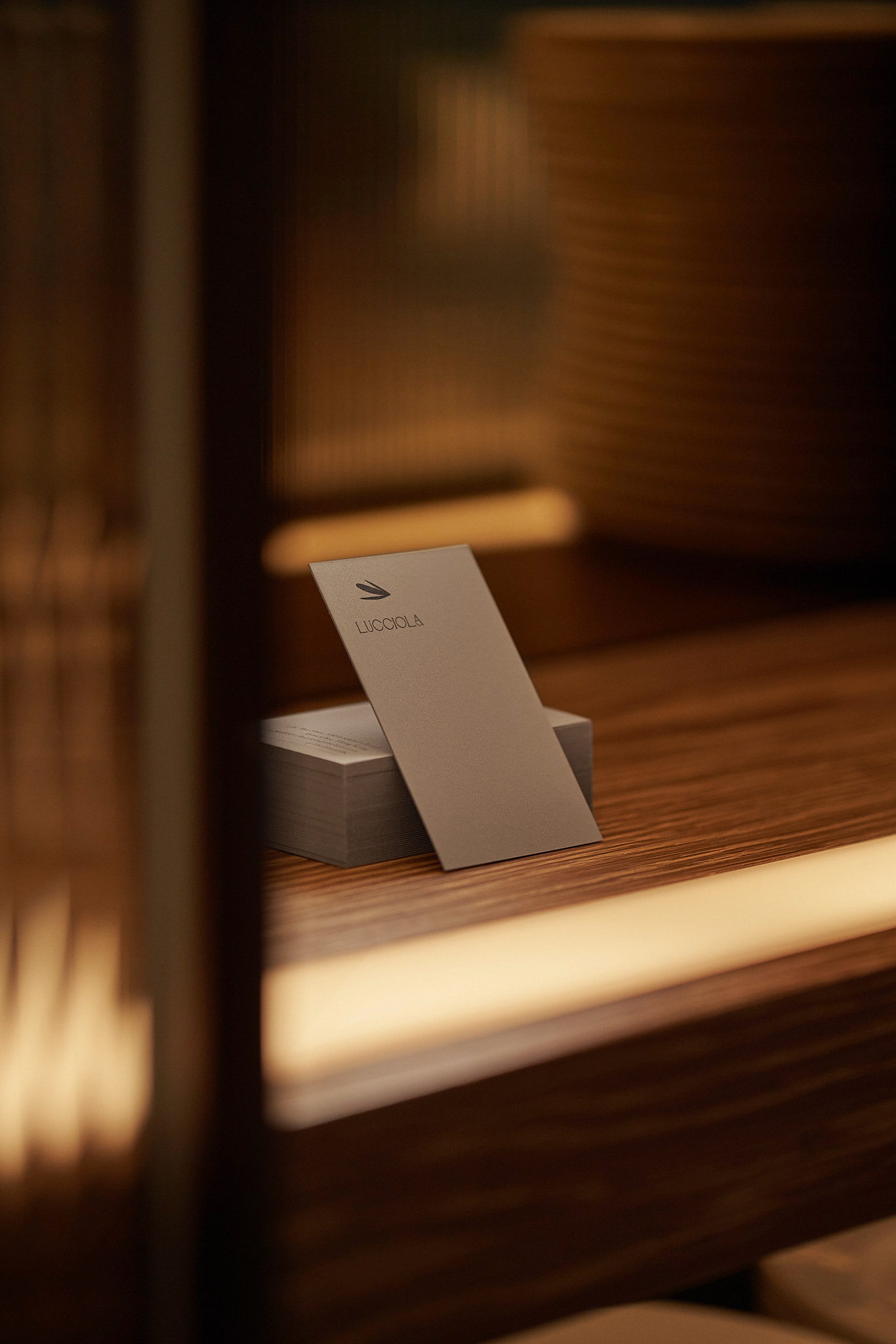
The interior design of the restaurant was created by Tara Bernerd, with an inviting moss green wall accented by copper tones. Based on this we created the visual identity and language for the Lucciola restaurant, which offers traditional Italian food with a modern twist. The word “Lucciola” means firefly in Italian, so we created a contemporary firefly motif inspired by the work of Georges Braque — also traditional with a modern twist.
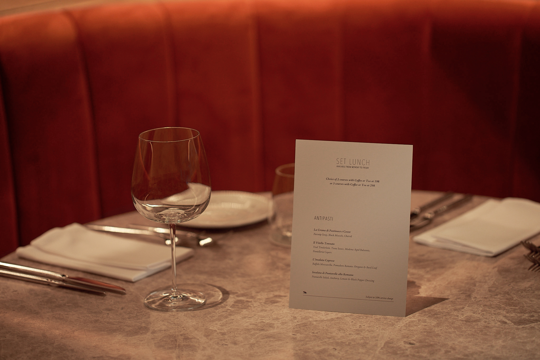
The menu and coasters come in a warm grey, so as not to clash with the already colourful and multi-textural interior design. The menu comes in a wonderfully textured paper, appealing to the tactile senses of the guests.
On a secondary layer of our visual identity, we designed a bill holder in brass, as a nod to the design in European restaurants. The holder is stamped with the open, sophisticated, and rhythmic typeface that the restaurant’s name is stamped in.