ZOKU – By The Hari Hong Kong
Brand Strategy & Design
Share
Service
Industry
Standing out in taste
Tucked on the second floor of The Hari Hotel Hong Kong, Zoku is a tasteful tribute to the culinary culture of Japan. As part of our work for The Hari brand, we were asked to design the experience and the visual identity for their restaurants. We were given the starting point of a Japanese restaurant, with which we combined the soul of the Hari brand, and thus created Zoku.
Designing with harmony
With a simple logo overlaid on more complex illustrations and textures, we were careful to avoid clashing with the interior design of the restaurant, done by our friend Tara Bernerd. Zoku is home to a cosy interior that stretches out into a wide open terrace: an ideal space to enjoy wine and sake late into the night. The interior features an asymmetrical wood slatted ceiling, with fluted glass and shades of pink; outside, guests can enjoy a three-storey moss wall.

An unlikely inspiration
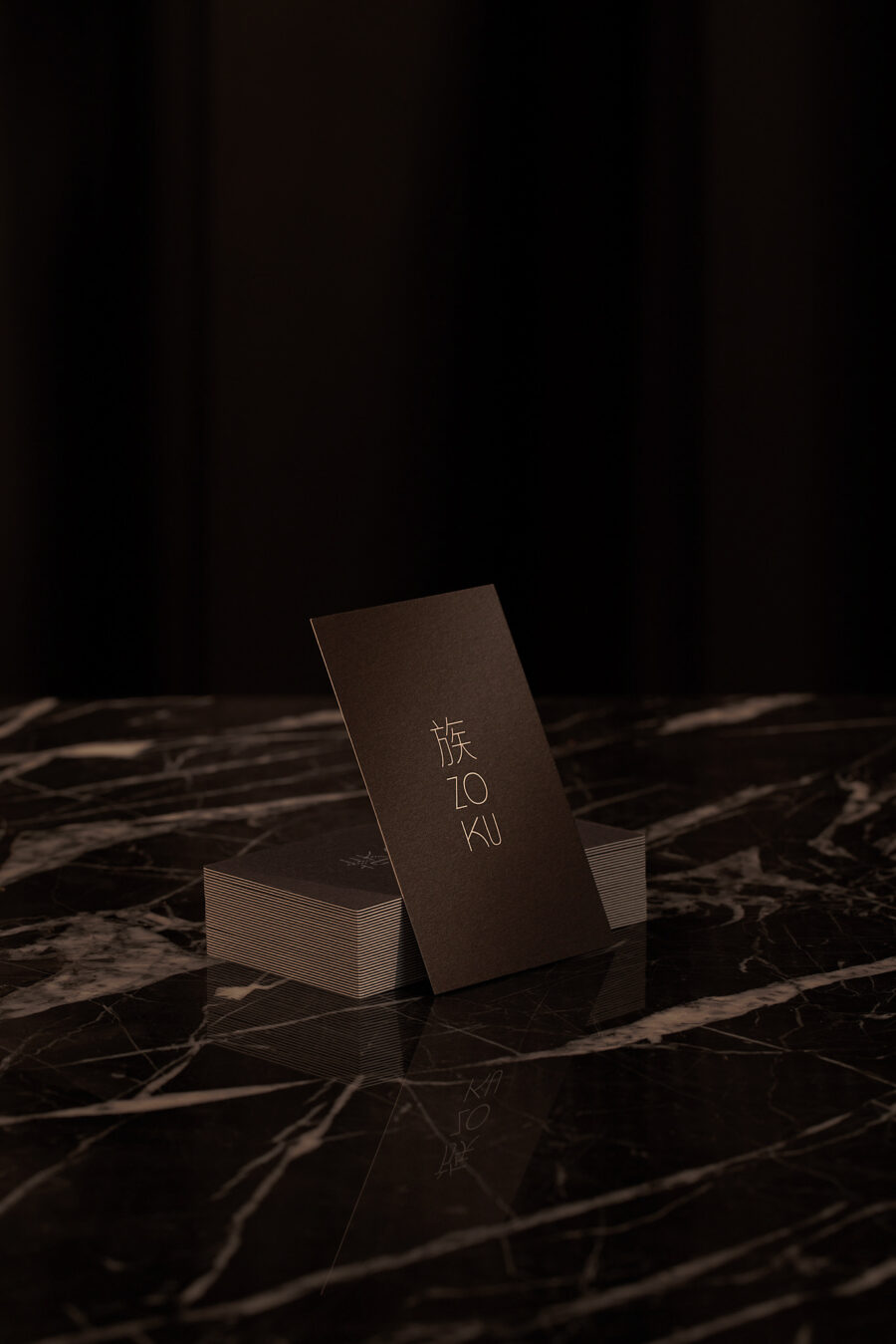
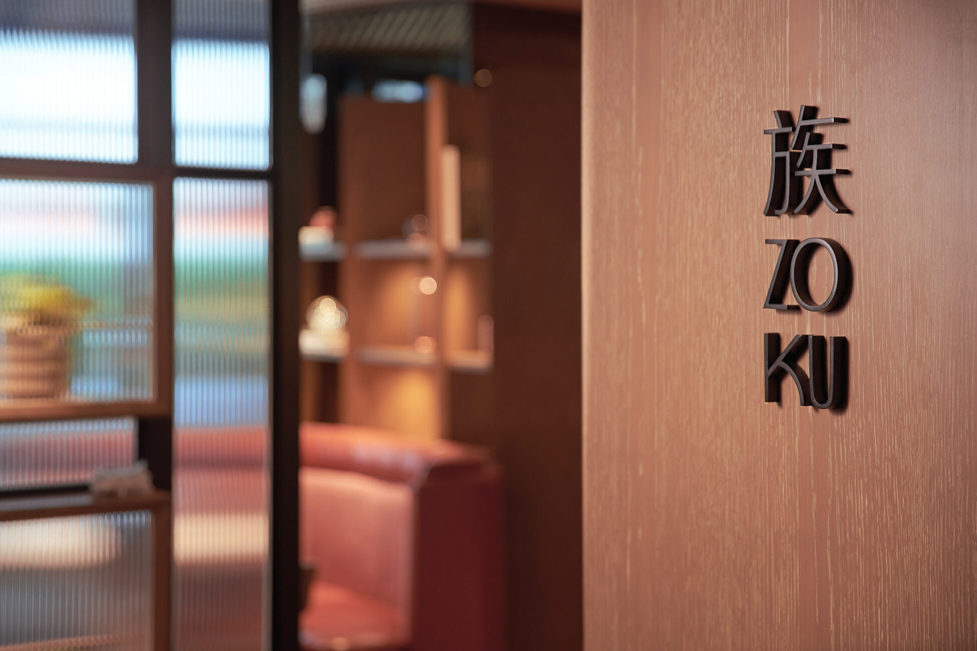
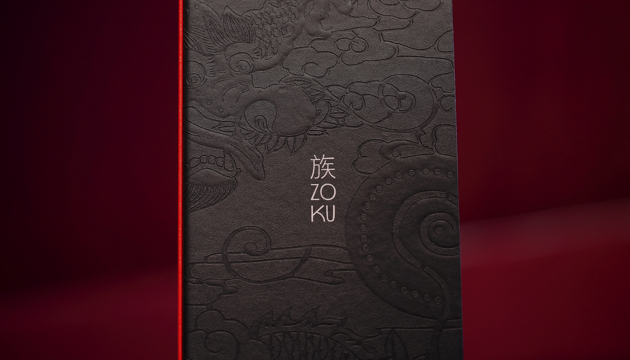
On the surface level, Zoku translates to “clan” or “family” in Japanese... but a true Japanese speaker will know that Zoku actually refers to the Yakuza syndicate, whose tattoo style informed the graphic that we used. As for the Hari, family is one of their core values, as this Hotel is the flagship hotel of the Harilela group & family. The name Zoku removes the connotations and leaves only the idea of a whole family is dedicated to hospitality. The Hari prides itself on revealing layers of a city's culture, so this insider story on our inspiration never ceases to surprise Zoku’s guests.
Our designers were inspired by the themes of Japanese body art, and created an elegant visual identity. Behind a sleek typographic logo, is a complex dragon illustration inviting our guests to come closer and have a good look. An eye catching poppy red gives an edgy accent to stand out against our dark visual identity.
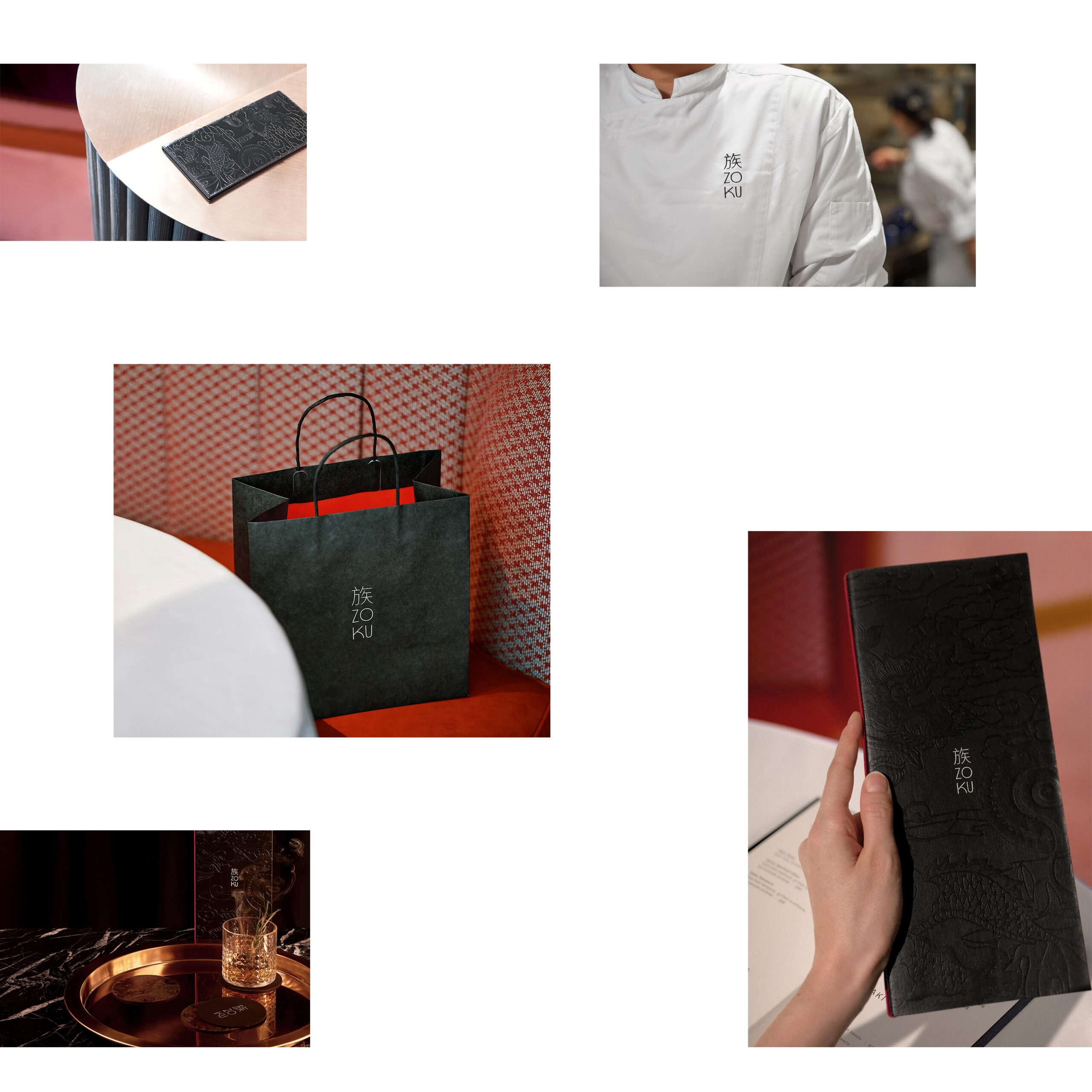
We took a special care in choosing the different materials & colours for the collaterals, in order to complement the dusty pink, velvety interior designed by Tara Bernerd and her team. Pop over to The Hari to see our work!