The Opposite House
Brand Strategy & Design
Brand Identity for Swire Hotels
Share
Service
Industry
Setting a precedent
Opened in August 2008, The Opposite House was a bunch of “firsts”: the first hotel from Swire Hotels, the first hotel designed by Kengo Kuma and our own very first hotel branding project.
As soon as we embarked on this project, we realised that we were in one of those rare “moments of change”. Swire Hotels was determined to answer the needs of a rising generation of travellers and create a new notion of what luxury meant in hospitality.
From the day of its opening until now, The Opposite House stands as a global landmark in the industry. Inspiring – Individual – Contrasted – Connected… some of those keywords have become the staple denominators for any hotel aspiring to coolness.
Infusing an identity
From the start, our goal was to create an unobtrusive brand identity and avoid the often overly branded experience of chain hotels. In that respect, the Japanese references in the architecture and interiors designed by Kengo Kuma were a great source of inspiration.
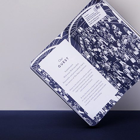
The brand identity is “infused” into the experience to let the imagination of the guests roam freely.
Being unobtrusive doesn’t mean we can’t be evocative. We created a subtle icon with two interlocking Ps, playing on the idea of opposing symmetry. The logo mark quickly became a favourite and earned itself the affectionate nickname of the “kissing Ps”. This back story was widely used by the service team as a first touchpoint to casually engage the guests into the brand narrative of the hotel.

1 / 1

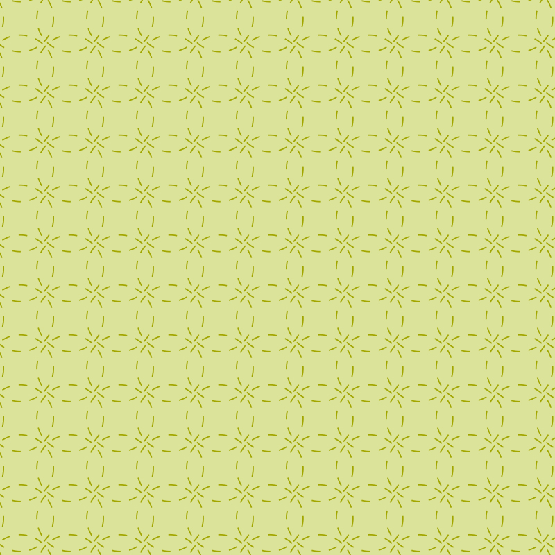

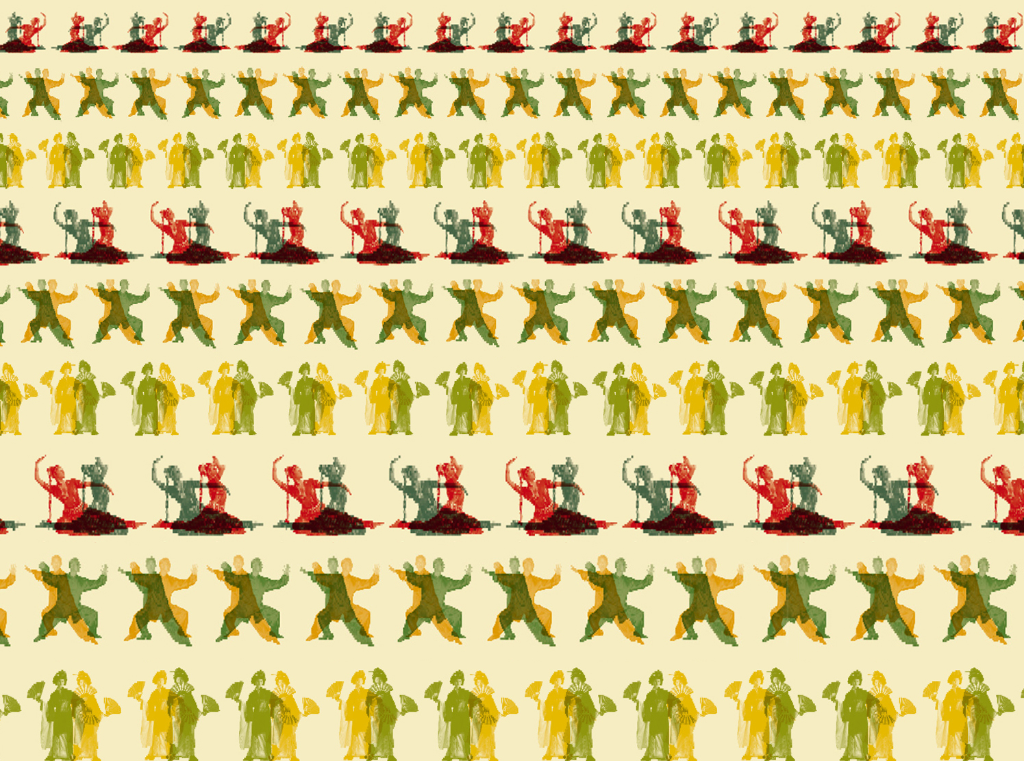
The acute awareness of the rhythm of time, a deeply Japanese concept, is expressed in the whole experience. Guests can (at will) embrace stillness and reflection in the rooms or plunge into the vibrancy and energy of the public spaces. The visual system is echoing this concept, with a series of overlaid coloured patterns evoking the change of light throughout the day.
1 / 1
Village Café
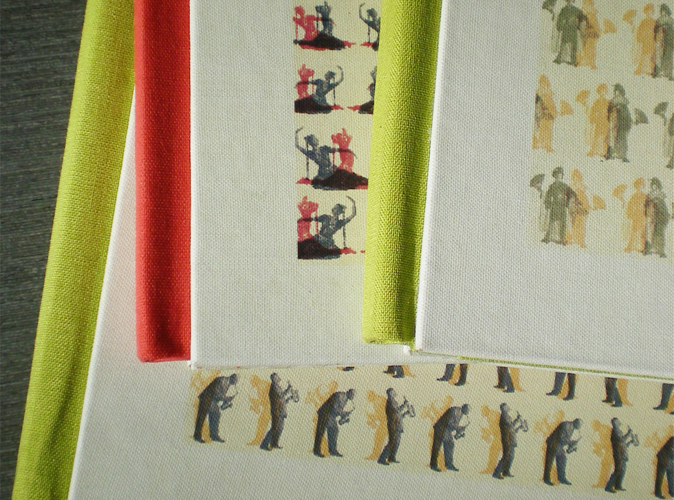
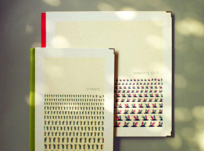
For the Village Café, a relaxed all-day restaurant filled with natural light, we created a series of characters that were applied as repetitive patterns on the bright menus: a Tai-shi master for the breakfast menu (‘Morning Tai-Shi’), a geisha for the afternoon tea (‘Lazy Afternoon’), an Indian dancer for the dinner menu (‘Evening Chill’) and a jazzman for the wine list (‘Cheers’).
