Hong Kong Children’s Hospital Wayfinding
Spatial Strategy & Design
Signage with Heart and Care
Share
Service
Industry
A hub of paediatric excellence
In 2014, Marc & Chantal was approached to design a comprehensive wayfinding system for Hong Kong Children’s Hospital, the first hospital in Hong Kong to specialise in paediatric care for children with serious and life-threatening illnesses. The project vision was to establish a state-of-the-art institution, positioned at the forefront of the healthcare industry in Asia.
Navigating through challenges
The complex nature of a children’s hospital presented several unique challenges for our team. Hospitals are high-stress, emotional environments where visitors may feel lost and disempowered. The physical layout of the site, with its vast array of specialised departments, services, and units can be overwhelming. Poorly-designed signage could add to a sense of confusion and impact the efficiency of operations. Additionally, although this hospital is dedicated to the care of children, people of all ages interact with the space, from infant and teenage patients, to adult staff and visitors. Our design had to accommodate the needs of all users, supporting them as they navigate through a maze of places and emotions.
Design with a human touch
We approached our design with extra sensitivity, empathy and compassion. Our mission was to provide patients, families, visitors and staff with a hospital experience that is intuitive, accommodating and positive.
Every voice counts
Through a series of workshops with medical staff and other stakeholders, we devised an emotion map of the hospital environment to help us better understand the needs of different users and give them a voice in the design process.
We charted typical journeys patients, visitors and staff through the space, allowing us to analyse common user pathways, identify directional decision points, and pinpoint zones of high human traffic and stress. Our analysis greatly shaped our spatial strategy, enabling us to define effective signage location and presentation for smooth and stress-free navigation.

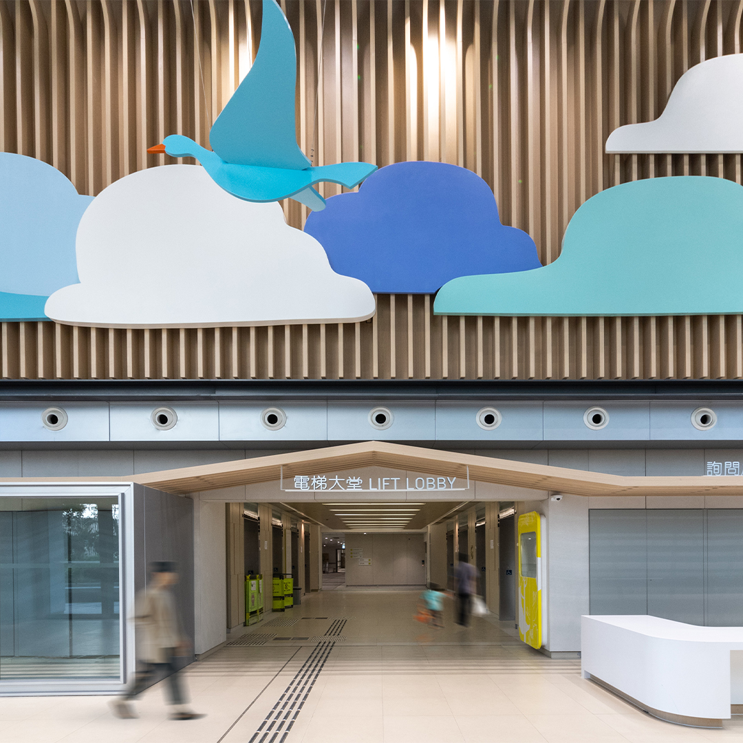
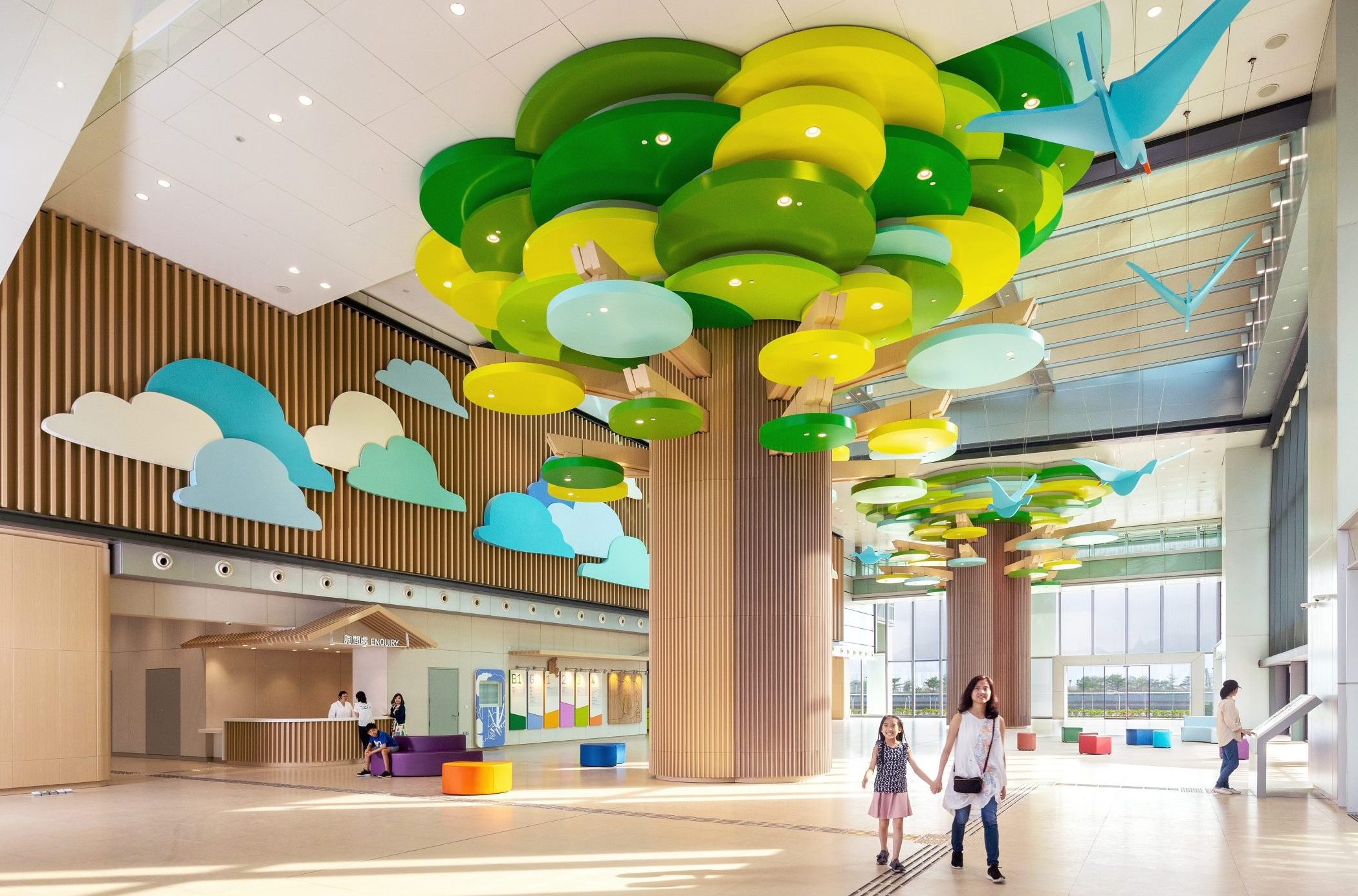
From a visual point of view, we were eager to develop environmental graphics that would bring vibrance to the typically drab surroundings of a hospital, enhancing the well-being of patients and creating a pleasant and dignified work environment for staff.
"Our visual system had to be versatile, striking a balance between child and adult aesthetics. Kid-friendly, but not overbearing, adult-friendly, but not cold and hostile"
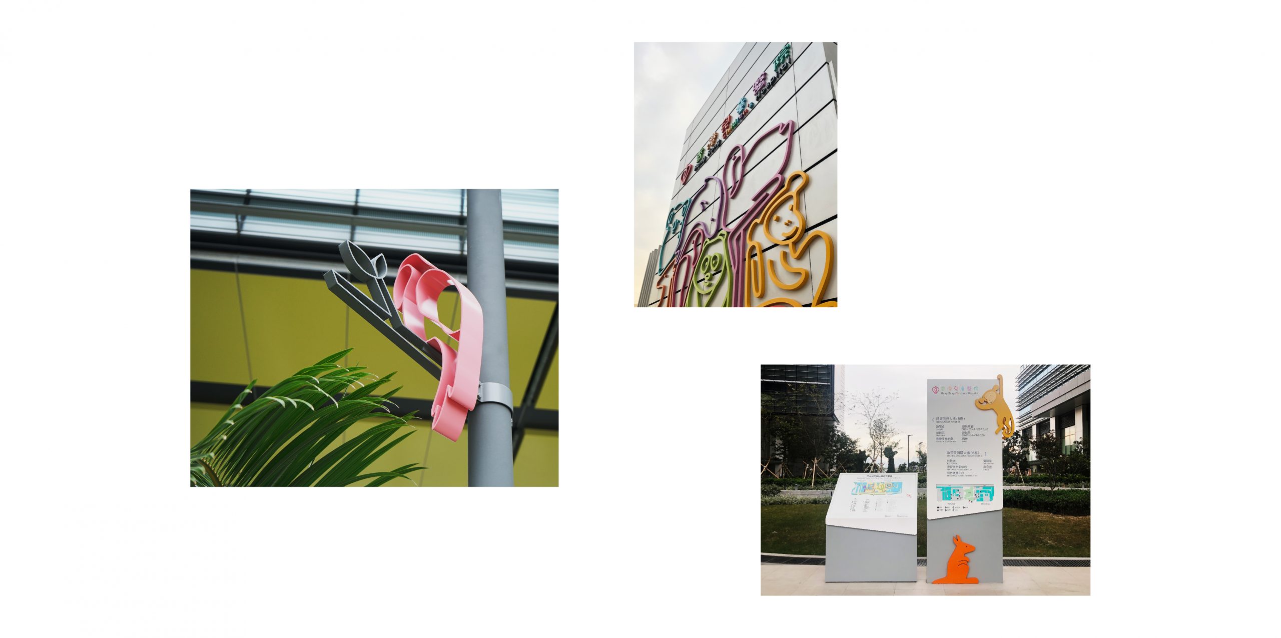
A habitat for life
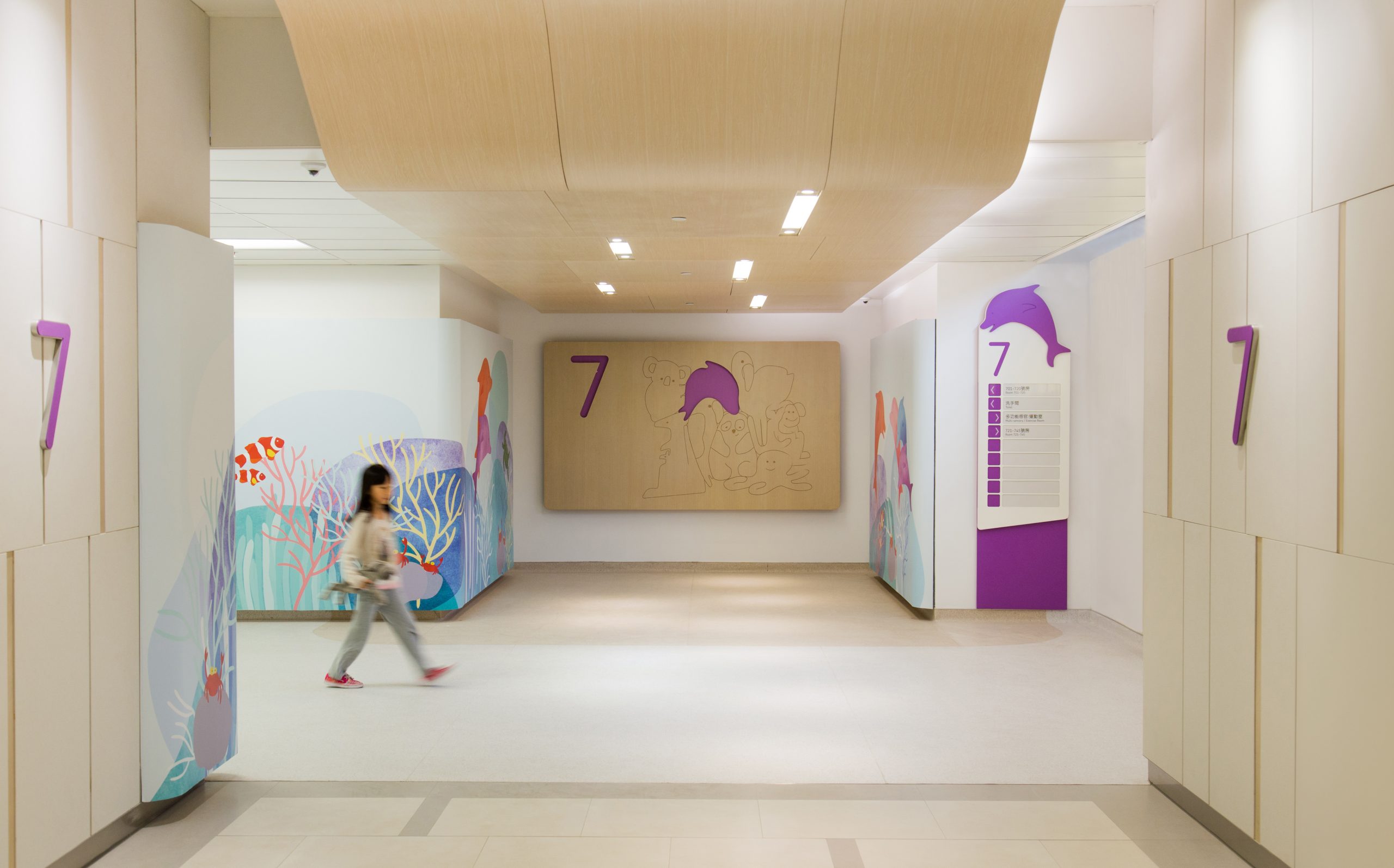
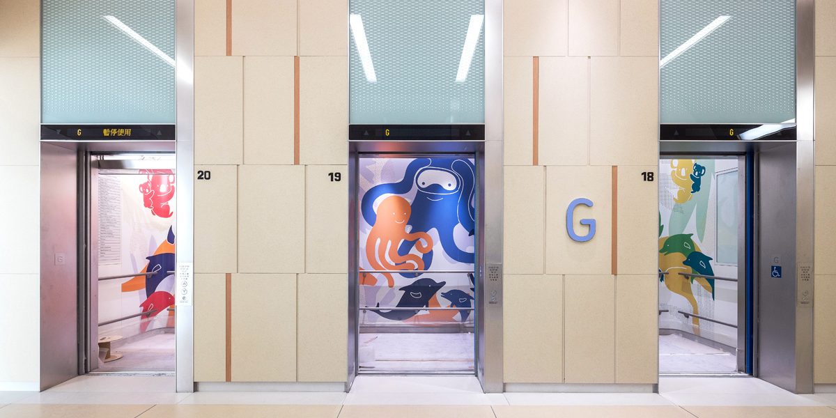
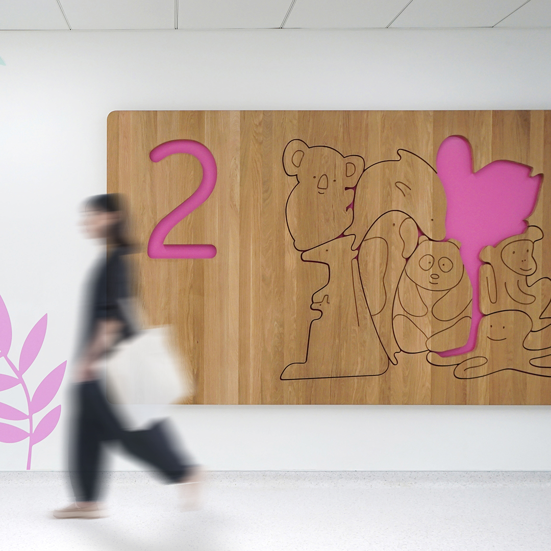
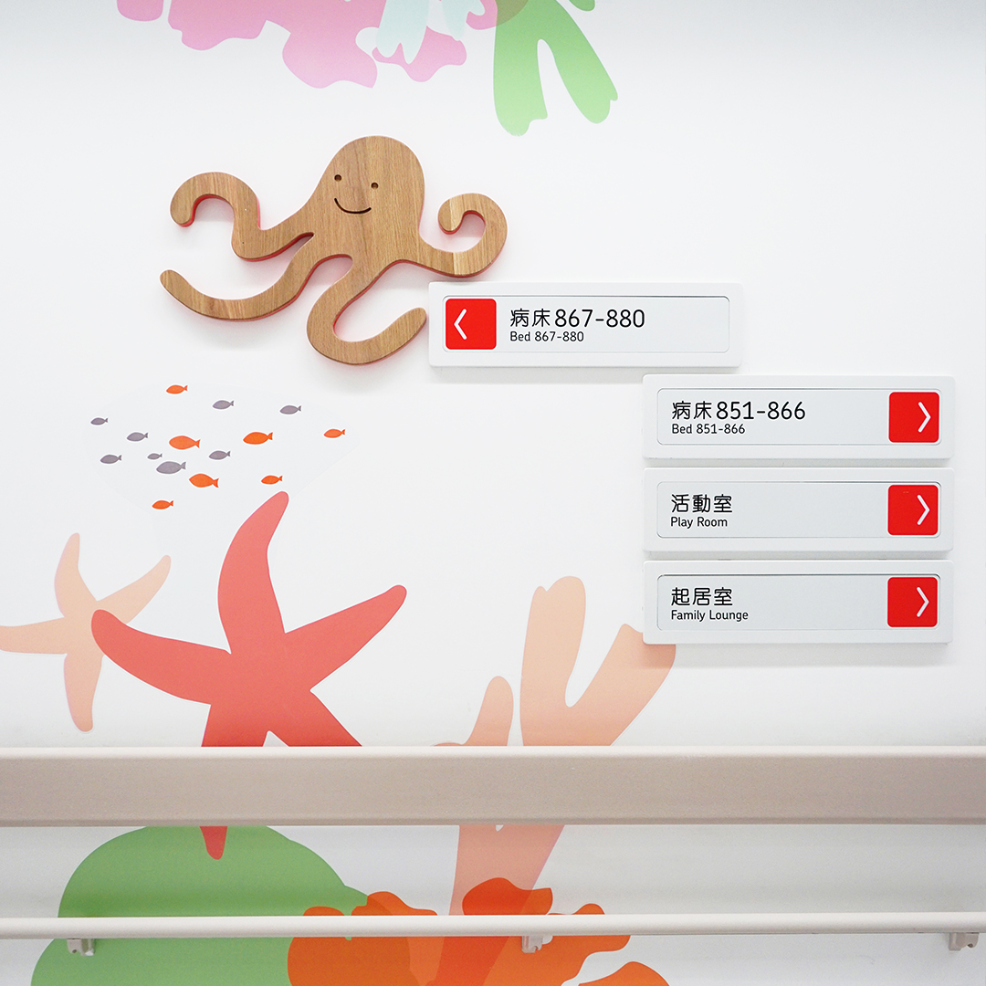
Our wayfinding system was centred on the theme of animals, drawing inspiration from Italian designer Enzo Mari’s animal puzzle. We curated a layered and unified navigational framework composed of eight unique animal characters, one for every patient floor. The animals we chose for each floor tell a story about the type of care available.
The 4/F is marked by a Kangaroo, a symbol of parenthood, to represent the neonatal units found on this floor. An Octopus lives on the 8/F, signifying treatment for patients with neurophysical conditions and longevity. The long-legged Flamingo, balancing on a ball at 2/F, represents rehabilitation and physiotherapy.
1 / 1
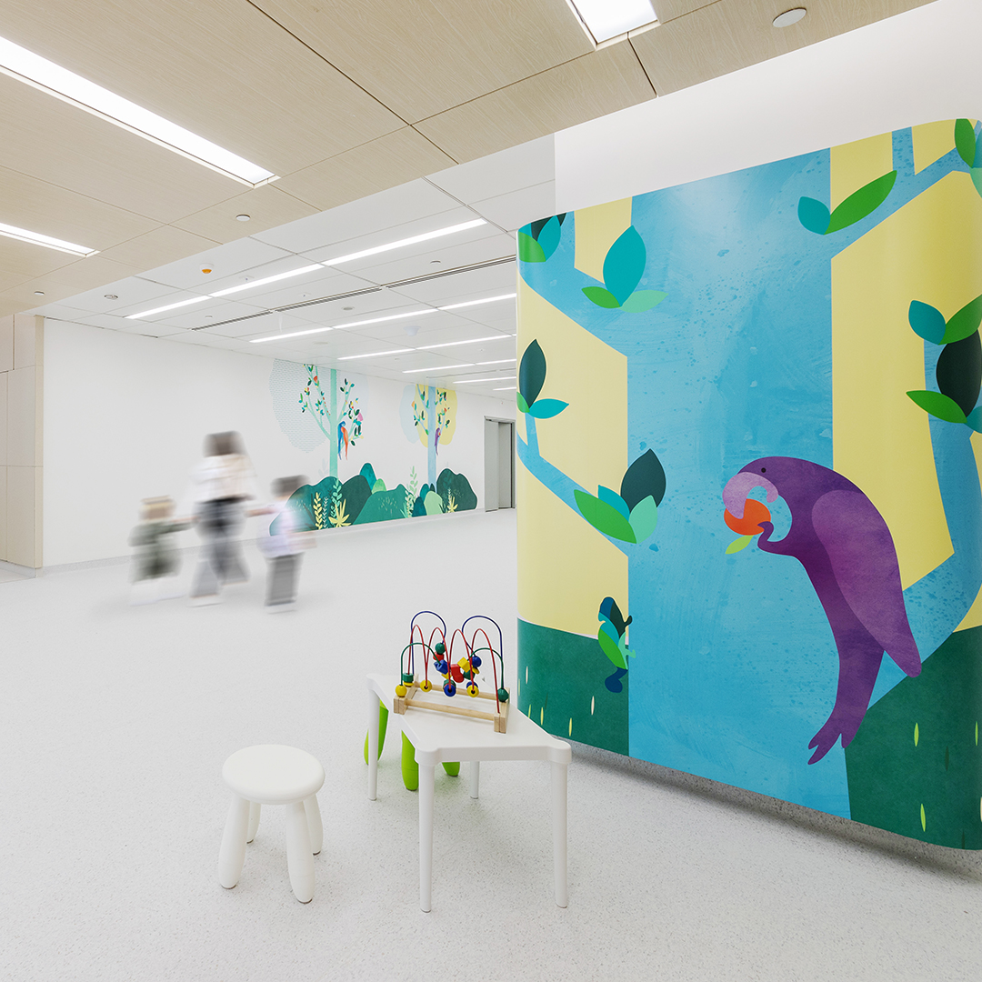
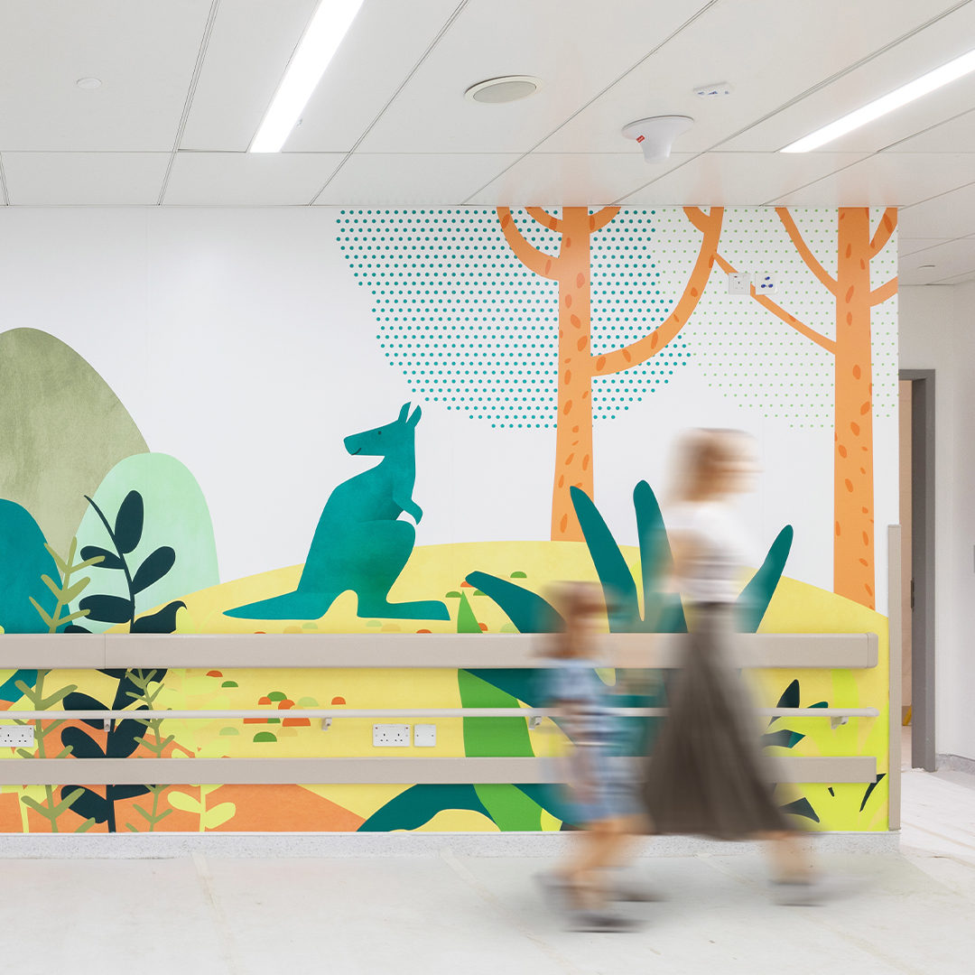
Beyond serving as a captivating visual language, these animals offer a myriad of storytelling opportunities, fostering meaningful interactions between patients and caregivers.
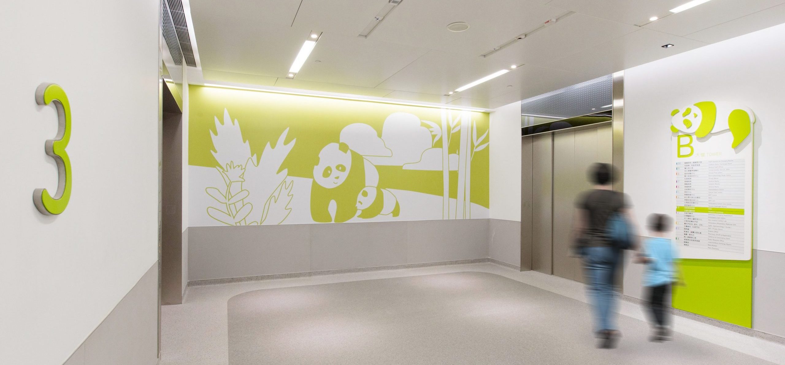
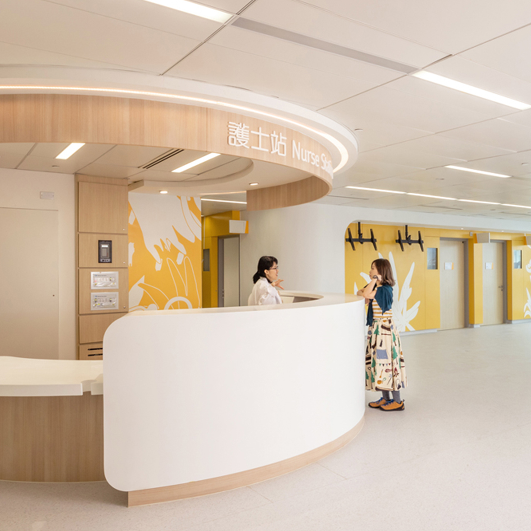
Signage with heart and care
Our signage employs a vibrant and refreshing colour palette, blending distinctive primary and accent hues to complement each animal theme. Not only does this choice of colour facilitate navigation by distinguishing each floor, it also infuses a sense of positivity and playfulness, alleviating stress for patients and their families.
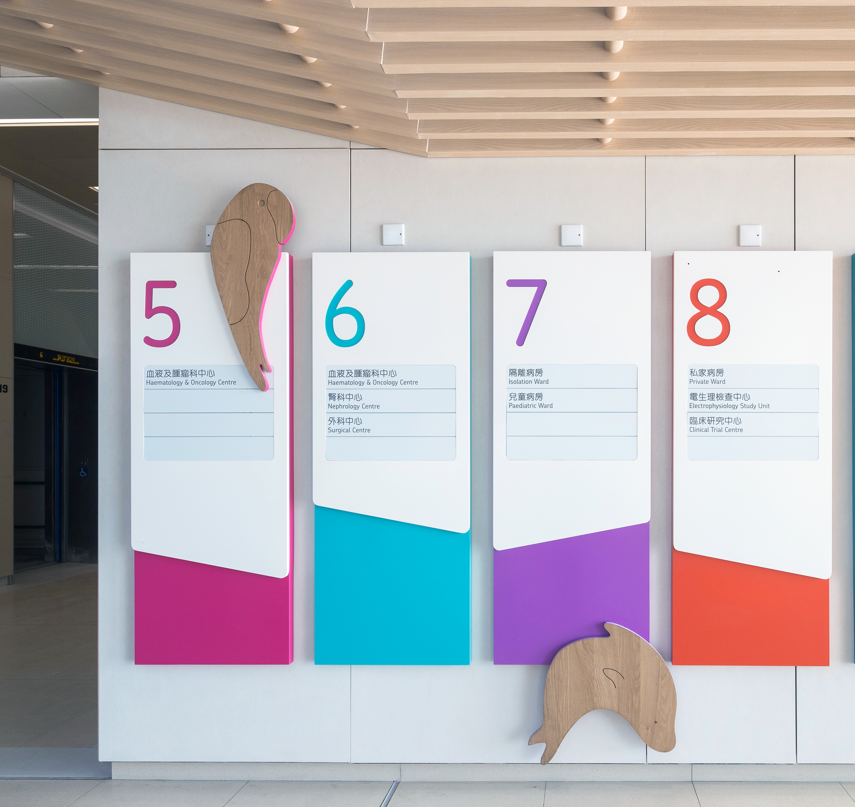
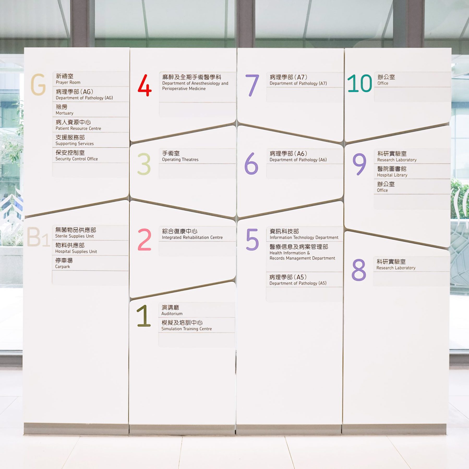
The typography of our signage reflects the approachable ambiance we strived to create. We chose Chevin, a highly legible and charming font, to imbue our designs with a welcoming touch and ensure clarity in conveying information. The rounded strokes of our Chinese typeface, MYuenHK, compliments the English font, adding another layer of warmth to our visual identity.
Since its inauguration in 2018, Hong Kong Children’s Hospital has become an award-winning institution, commended for its imaginative décor, innovative signage, and warm atmosphere.