H.A.N.D.S SHOPPING MALL
Brand Strategy & Design
Visual Identity and Wayfinding for Link REIT
Share
Service
Industry
New beginnings
H.A.N.D.S mall was built in the 1980s as two interconnected shopping malls in Tuen Mun to serve residents of the surrounding housing estates. Aiming to attract a younger demographic to the area, owners Link REIT hired us to revamp the identity of the mall, in order to inject energy and liveliness into its neighbourhood. We needed to develop a single identity for the two connected commercial complexes while retaining the existing name. Our scope also included super-graphics for façades, and the elaboration of a wayfinding strategy that would solve a challenging site configuration, with complex circulation patterns through multiple blocks.
Connecting the dots
We thoroughly surveyed the site in order to best understand users’ needs, and hosted joint brainstorming sessions with both client and project architect teams. Rather than addressing the issues of branding and wayfinding separately, we looked for integrated solutions that would seamlessly connect all the dots – allowing visual identity, environmental graphics and signage to use a common language.
Figure of speech
Our creative answer retained the fun and friendly spirit of the name H.A.N.D.S, originally an acronym for “Have a Nice Day Shopping". We developed a visual identity system that served as a platform for the playful and versatile graphic communication language.
1 / 1
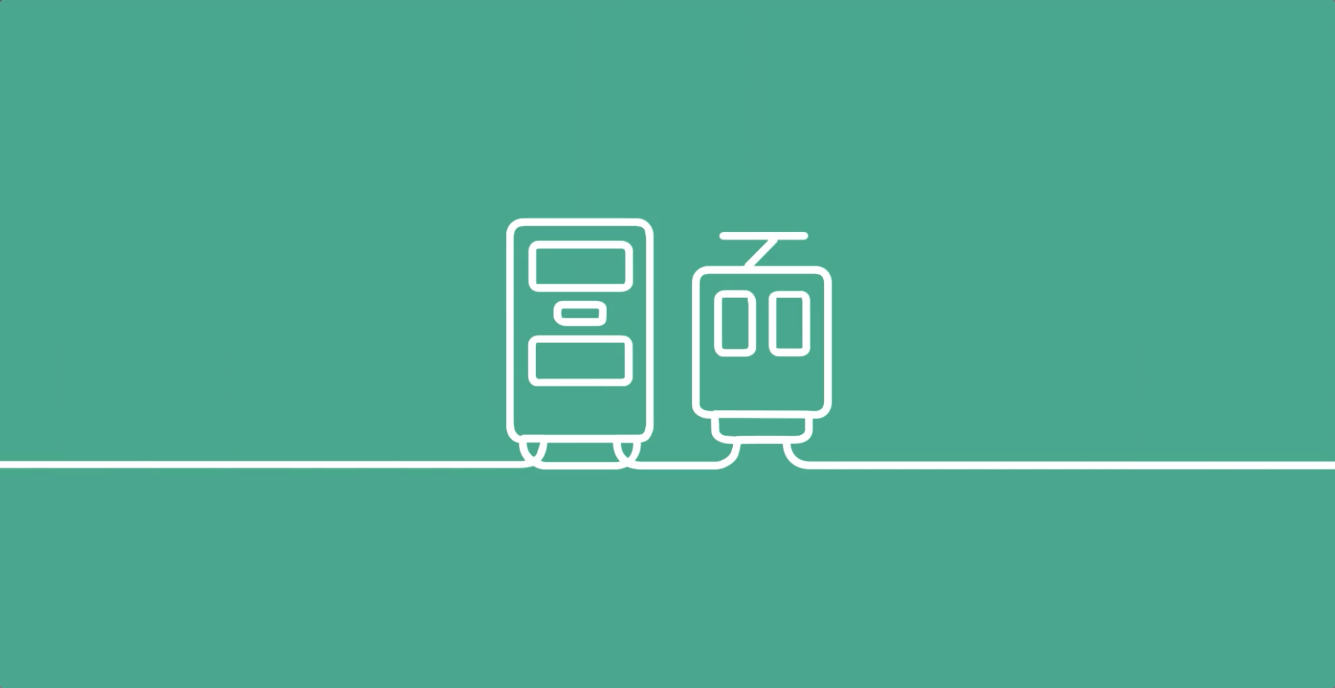
Drawing inspiration from the architectural fluidity of the façade renovation scheme, we created an icon system linked by a continuous line that flows through the buildings. Playful messages were mixed with pertinent navigation cues on feature walls, in order to make the environment more visually stimulating, as well as informative for shoppers.
1 / 1
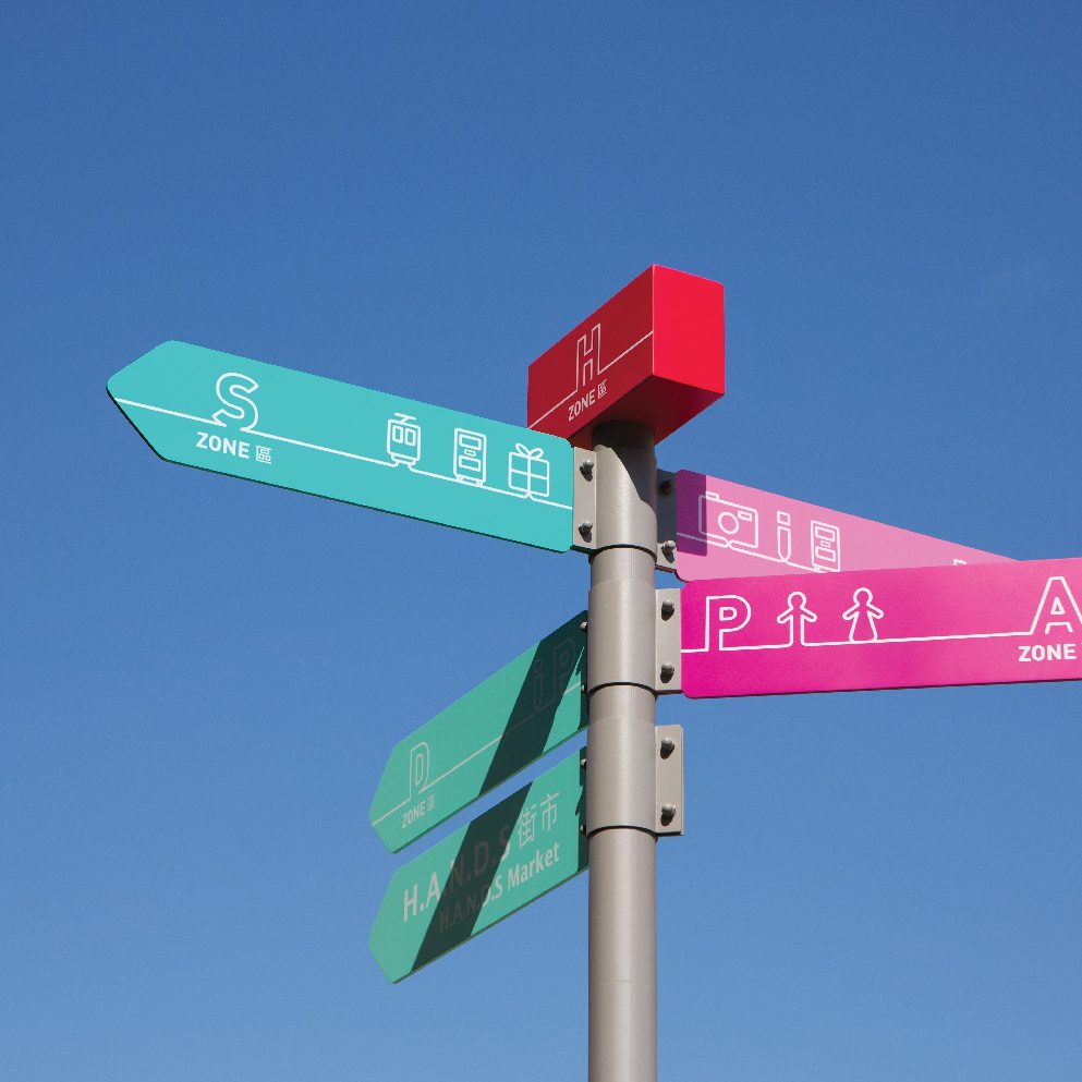
Follow the hand
Straddling the main road separating the two housing estates, On Ting and Yau Oi, the site presents a challenging mirrored configuration, proving confusing for visitor’s orientation. To address the issue, we gave the two sides a distinct, contrasting colour palette. Within the scheme, we re-organised the complex’ segmentation into five zones, articulated around a central core. Each zone was allocated an alphabetical letter from the word H.A.N.D.S, facilitating visitors’ orientation and enhancing brand recognition.