FOUR SEASONS HOTEL HONG KONG
Brand Strategy & Design
Share
Service
Industry
Photos Courtesy: Guy Bertrand
Relaunching a haven of sophistication
Standing tall on the edge of Victoria Harbour, the Four Seasons Hong Kong is a haven of quiet sophistication nestled within the hustle and bustle of the Central district.
Following a full redesign and refurbishment by Peter Remedios, we were asked to embark on a journey to reimagine the brand identity of the illustrious hotel and infuse a renewed sense of sophistication along the major guest touchpoints.
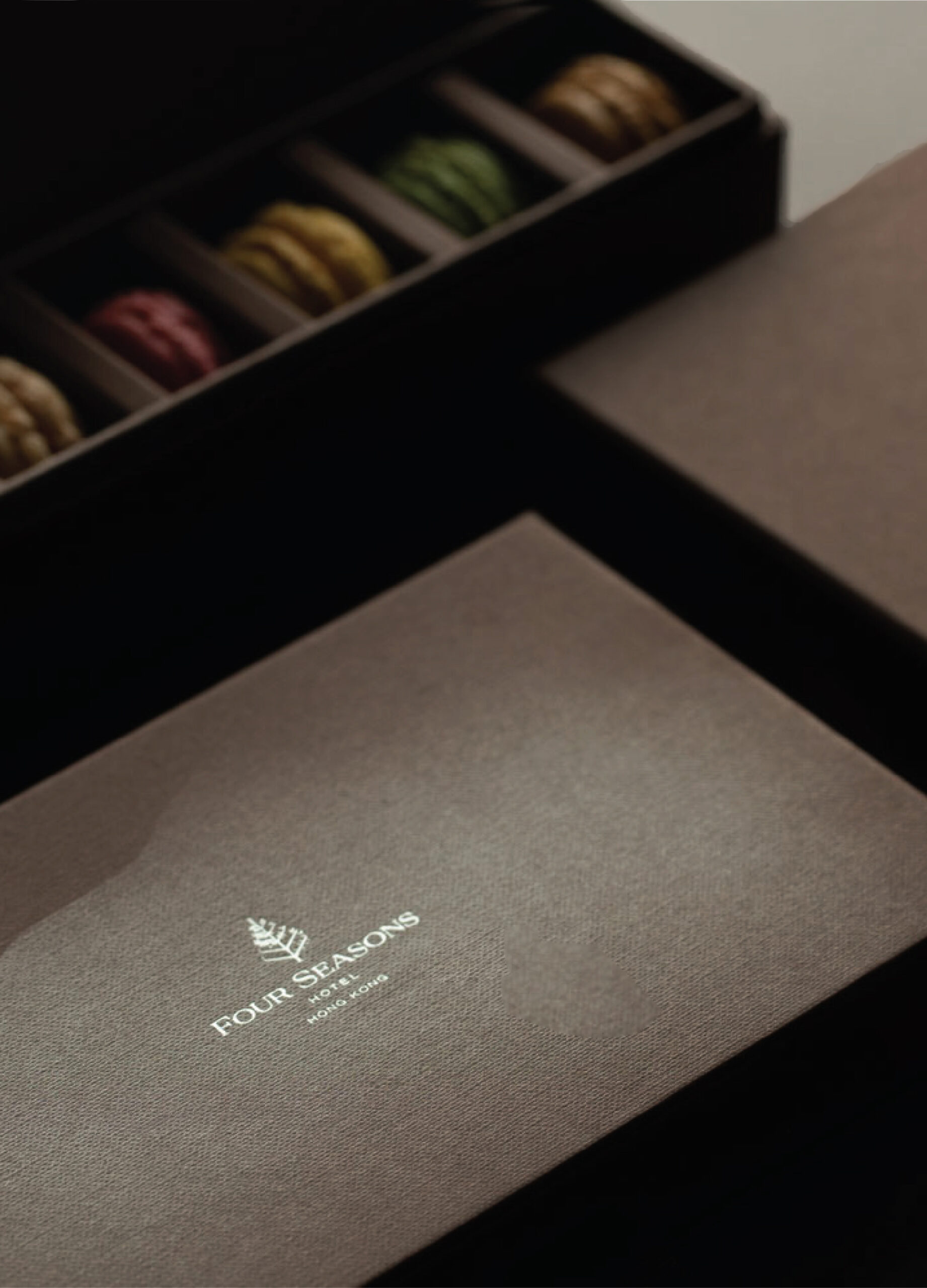
Our poetic interpretation, “Through the course of time’, is taking cues from the Four Seasons brand itself and the ever-changing spectacle of the Victoria Harbour, which all guests can enjoy from the prime seat of their rooms. The smooth transition of time is materialized in a subtle pattern in which each season has its own intensity. The whole brand identity is very tactile and organic with a special silver ink running through an enticing palette of chocolate hues as if the whole set of packaging and collaterals had been dipped into a delicate mixture of luxury and sophistication.


Lasting Impression
First impressions do indeed last, but at Marc & Chantal, we always strive to build long-lasting layers of depth within our designs. It is the mark of classic timelessness. Here, the identity is both reflective and absorbing, pulling in deeper the guests at every step of their journey within the world of Four Seasons.


Luxury Is In The Details
Time is the ultimate luxury. The simple fact to take the time to craft those details is in itself an act of luxury. It signifies care and respect.
Care and respect translate into the engagement and loyalty of the guests. With such philosophy, even the most humble piece of collateral becomes a vivid point within the dialogue between the brand and its followers.


The reimagined brand identity for the Four Seasons Hotel Hong Kong serves as a powerful focal point for the relaunch of the property. It resonates with the ever-renewed commitment of the Four Seasons brand to contemporary luxury and the always-evolving aspiration of its guests to a pared-down yet evocative approach to hospitality. The quiet dedication to details is here to infuse a sense of meaningful exploration and discovery within their journey.


Holding the brand in the palm of your hand
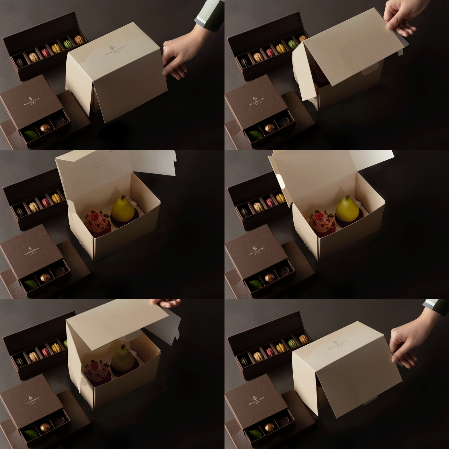
Beyond touching the staying guests, such brand as the Four Seasons is also meant to be shared with a wider audience. This is why we have spent so much time working with the F&B and operation teams to design a full range of packages for take-away and delivery products and services. The promise of the Four Season can hence be carried around, shared, and gifted to its legions of fans around the city.


